75 photos
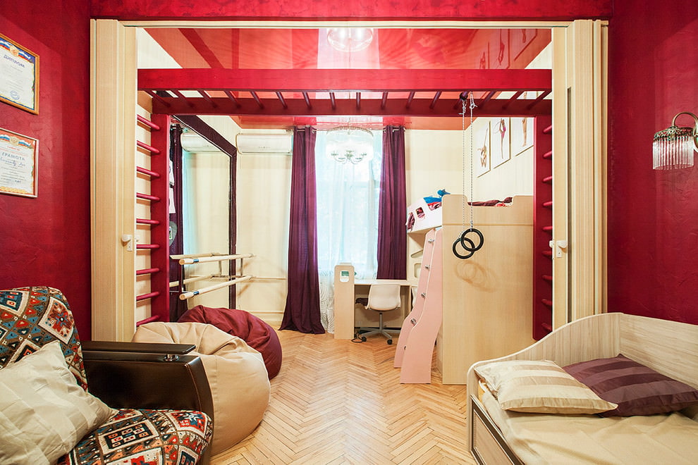
Separation of space through the installation of interior partitions is a prerequisite ...
The choice of colors for wallpaper, ceiling and flooring is of particular importance. It determines the mood and future design of the room. Before choosing the material and method of surface lining, you need to decide on the color. It is necessary to choose a gamut that will suit the design you like, the layout of the room and the psychological mood of the owner. Today we consider the red color in the interior, its effect on the person, design, perception of the atmosphere and laws of use. Let's get started!
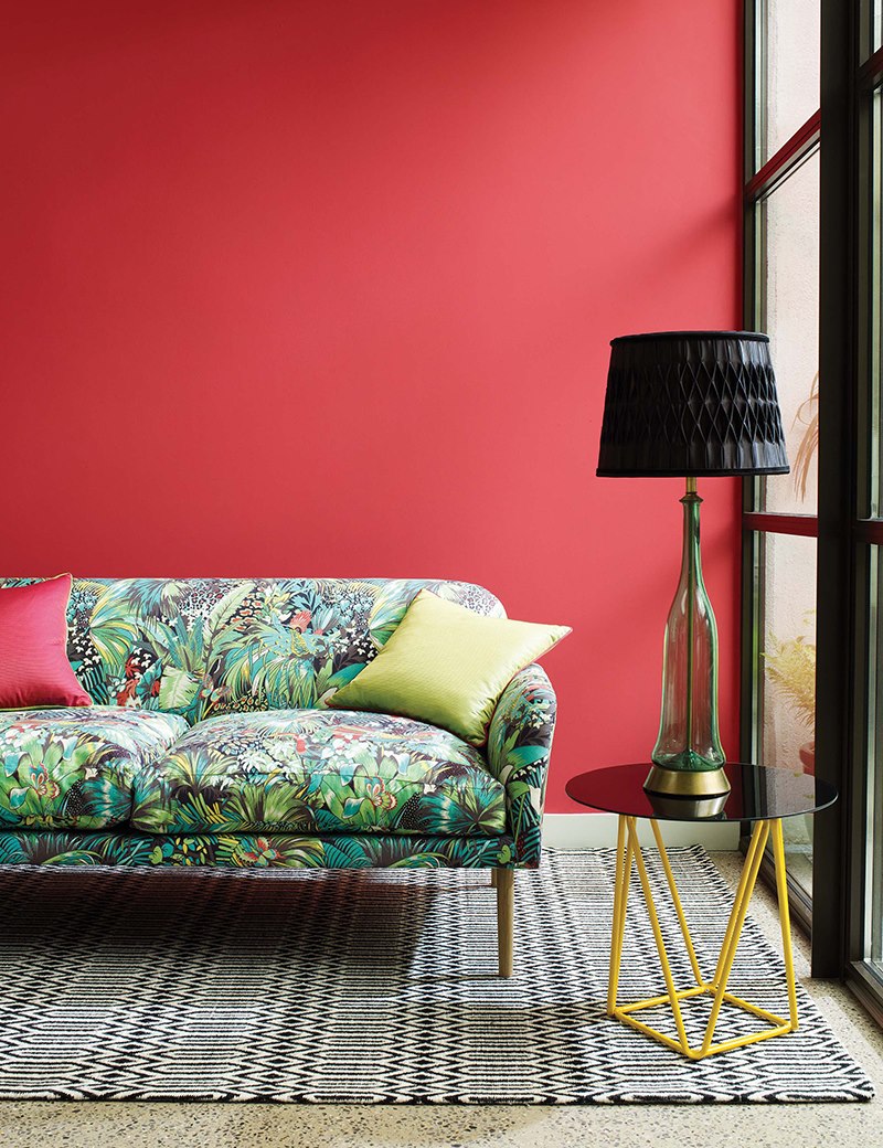
The red color in the interior looks stylish and at the same time ambiguous
Content
Red has a very strong energy. According to Vedic beliefs, he is the patron saint of the first chakra of Manipura. It is the root of life, it is responsible for the physical and emotional state of a person, his health, the ability to survive in any situation and rehabilitate himself from shocks. This chakra is the foundation of human life. Consequently, the color that is its patron is strong.
To create a calm atmosphere with bright accents, use the red on white technique.
The reverse technique “white on red” allows you to create a harmonious atmosphere, because white color is able to balance any interior
In modern psychology, it is believed that red is able to strongly influence the human psyche. He is exciting. And that means - enhances a person’s emotions and feelings that he experiences at the time of being in such an environment. It can cause strong emotional arousal, both positive and negative. Depending on the mood, it can cause anger, irritation, joy, excitement. It is worth noting that the evoked feelings will be quite strong.
It has been proven that this color has healing powers. For this reason, in traditional medicine, it is advised to wear appropriate clothing during illness. It is believed that this will help a speedy recovery.
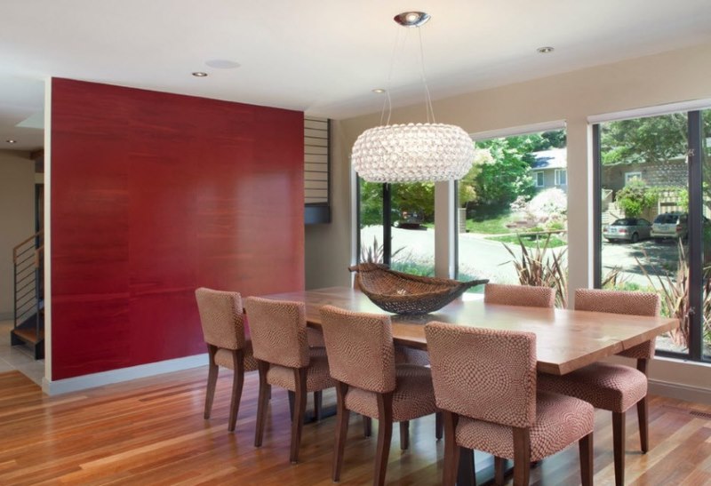
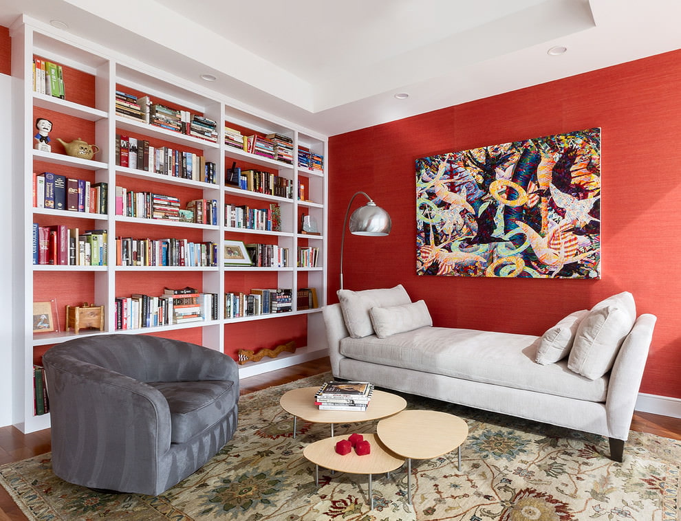
You can make the interior diverse by painting one of the walls in red
You met the symbol of life. It has the property of strongly affecting the human psyche, so you need to be careful when embodying the red interior in life.
Red refers to the spectrum of warm tones. Consequently, he conveys these properties to the design. Depending on which shade you choose, you will get the appropriate result.
Bright will give an atmosphere of spaciousness and freshness. This option is suitable for a small room. Gentle tones are more used for the nursery or bedroom.
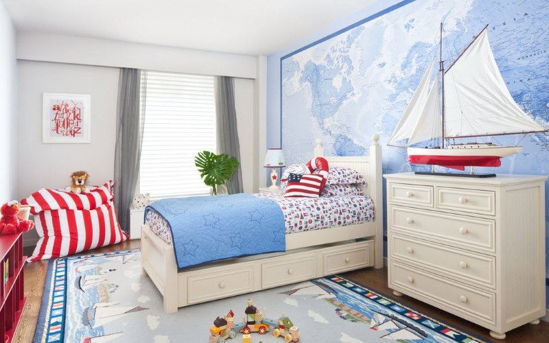
For the nursery, it is better to take light blue as the dominant color, and add a few accents in red, emphasizing the sophistication and respectability of the situation.
But in general, this color is rarely used for small rooms, since very bright and dark shades make the room visually smaller.
Ruby helps to focus and concentrate, so it is advised to use it in your office. But you should not use it in abundance, as it is quite heavy for visual perception, and can cause fatigue.Remember the rational use of color and harmony.
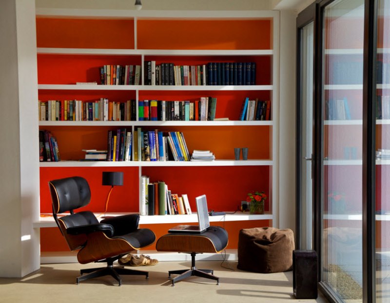
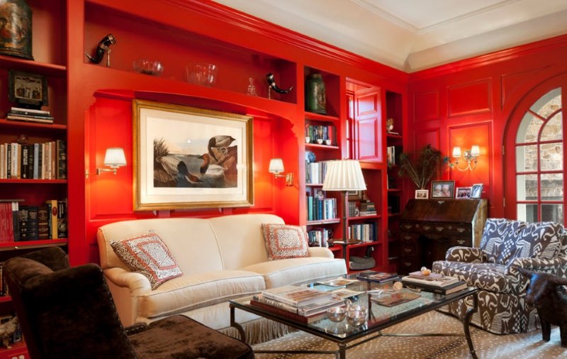
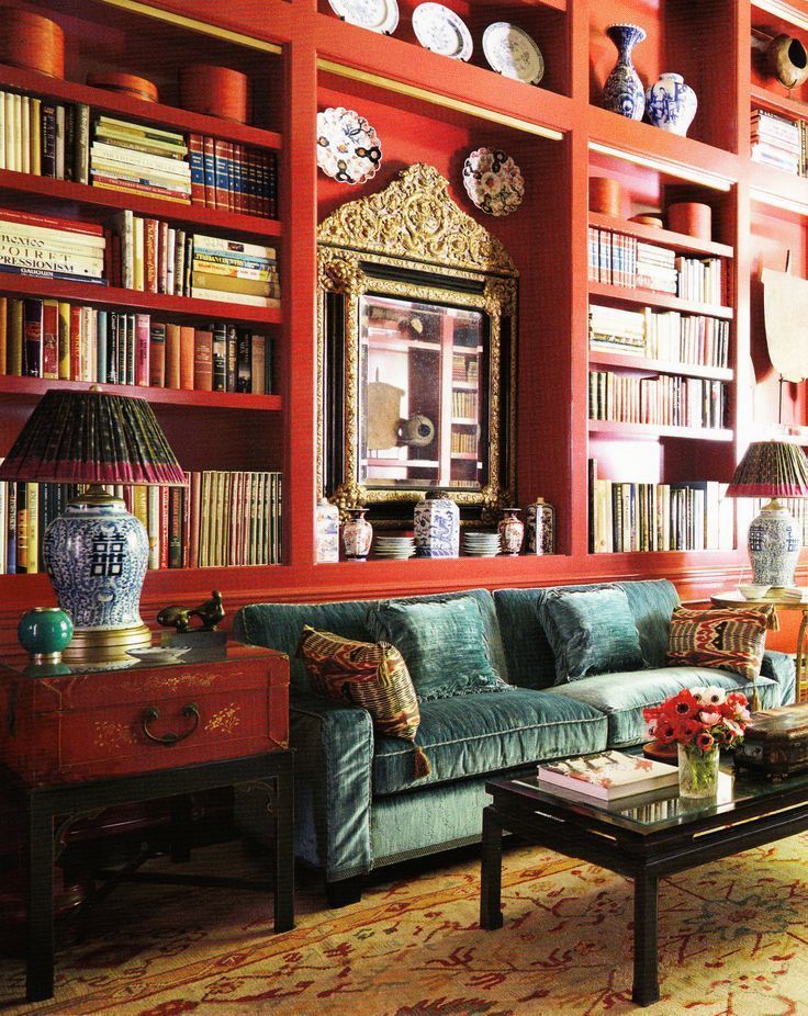
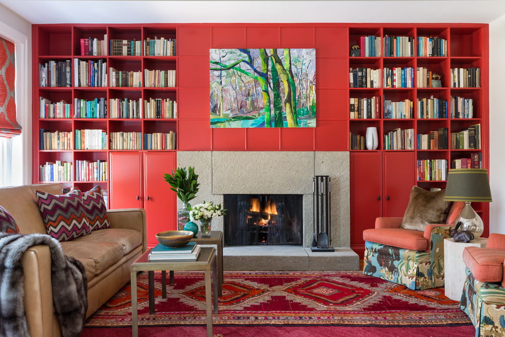
Open bookshelves look gorgeous against a red backdrop
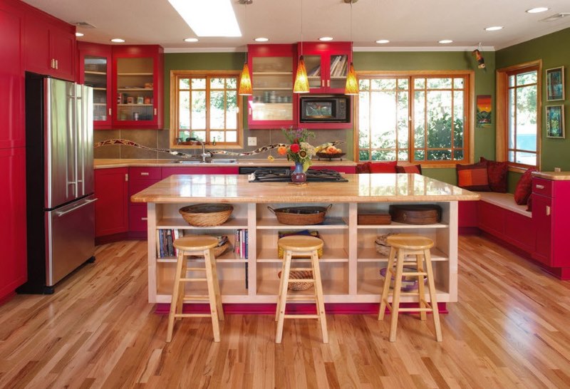
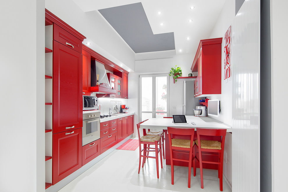
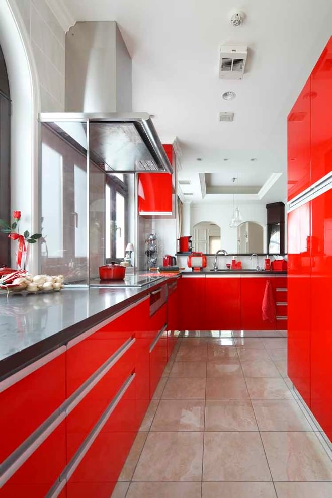
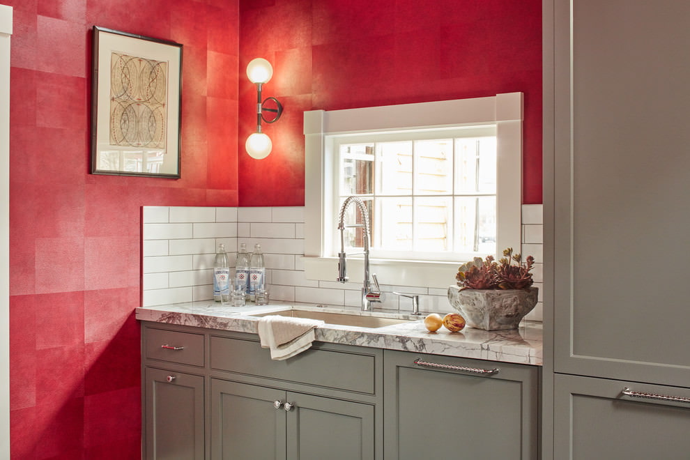
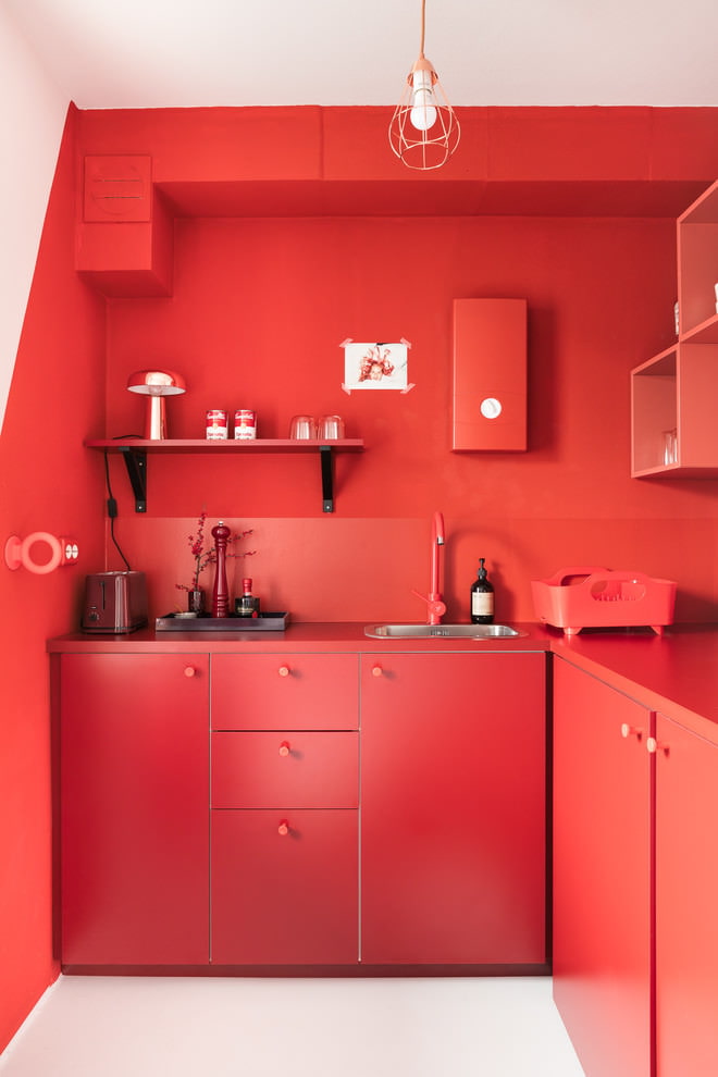
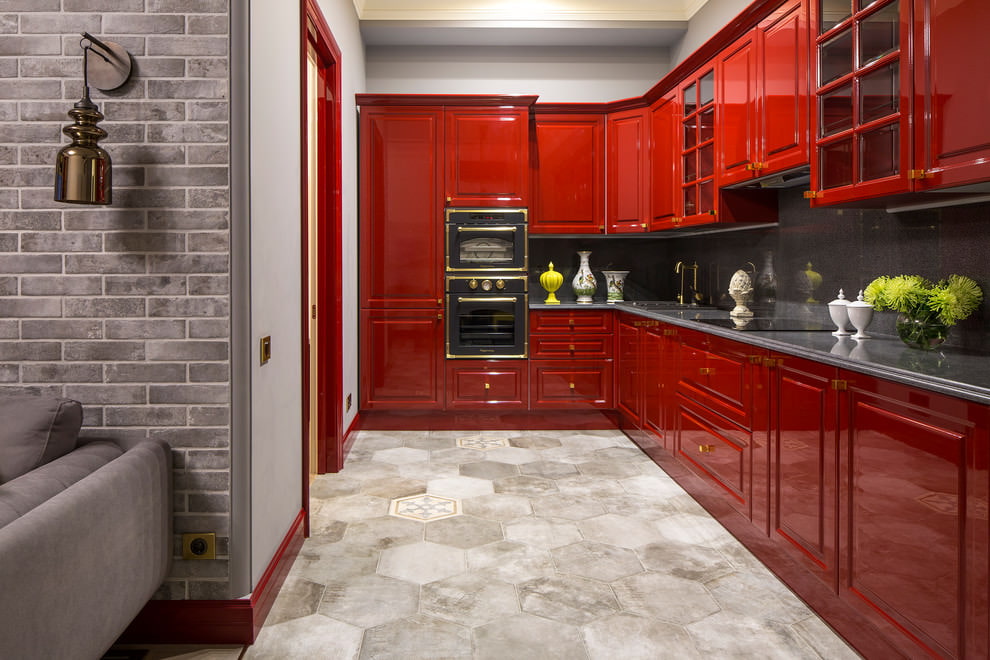
Being warm, it can cause appetite and a beneficial effect on digestion. This makes him a frequent guest in the kitchen.
In general, it is bright and dangerous, able to give bright notes, but if used improperly, make the room gloomy and difficult to perceive.
Now we can proceed to a detailed analysis of different shades and their use in the interior.
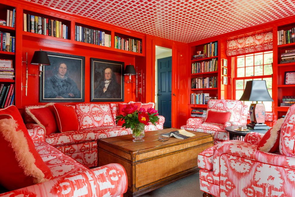
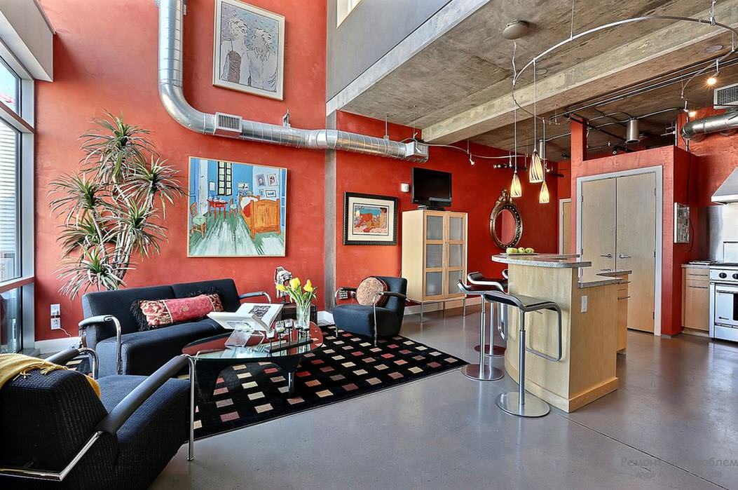
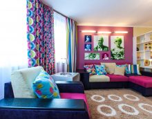
Let's start with the traditional. Bright and saturated, he perfectly took root in modern trends. Minimalism, high-tech, loft love him very much. Despite their focus on simplifying everything, they accept bright accents, the main thing is that they comply with the laws of style. Most often, one wall is painted in red or the presence of details of this color, such as textiles or decorations.
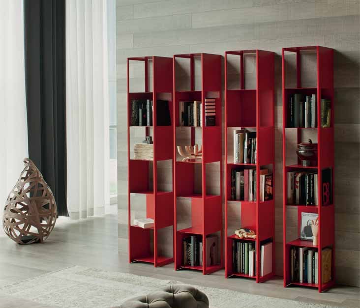
Such original shelves are suitable for both minimalism and loft.
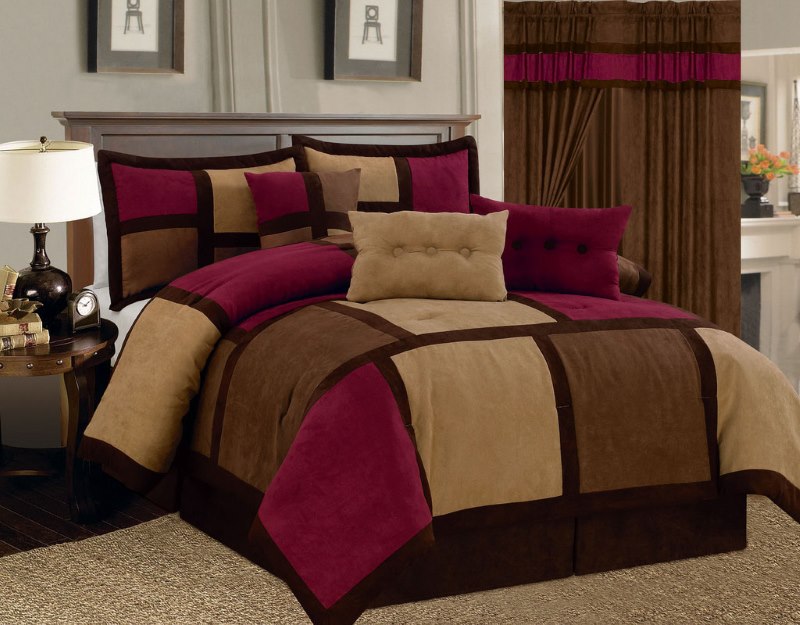
Bordeaux will also help you create an interior in this spirit, being part of the main spectrum. This tone represents calm, as it is deep and rich. Its only drawback is that it is difficult to combine. A pair of burgundy can make up white, beige, gray.
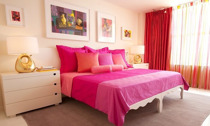
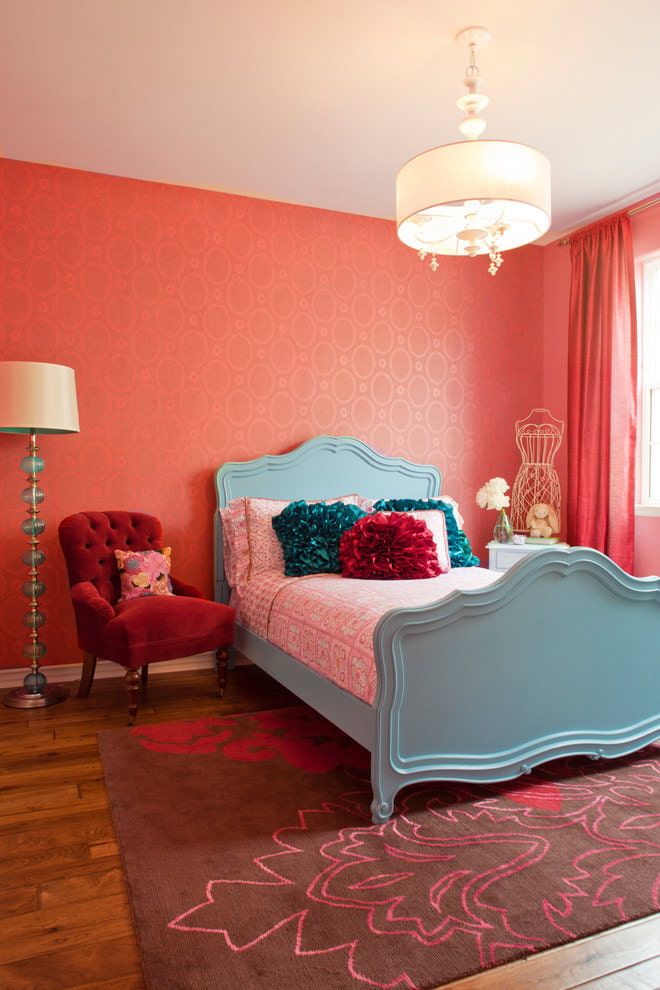
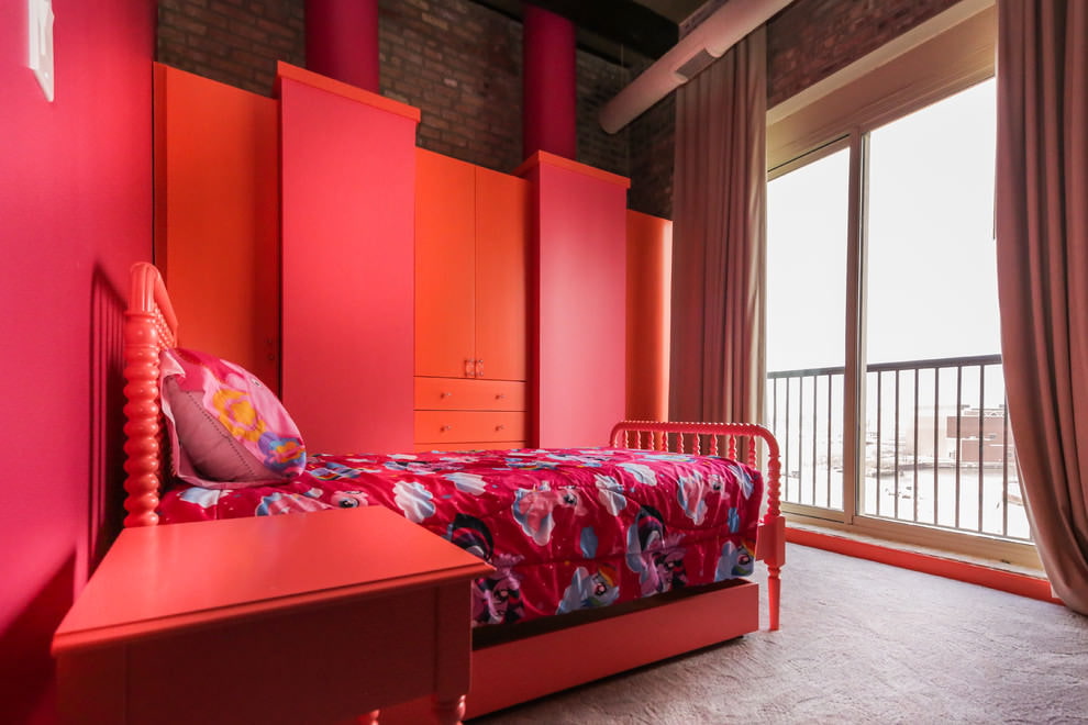
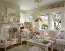
Pink is not so often found in a modern interior, considered infantile and difficult to combine. But it is suitable for creating a nursery. It also gets along well with Provence and country.
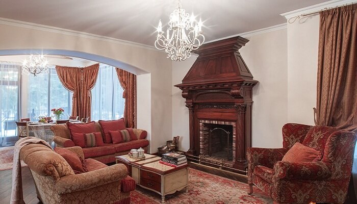
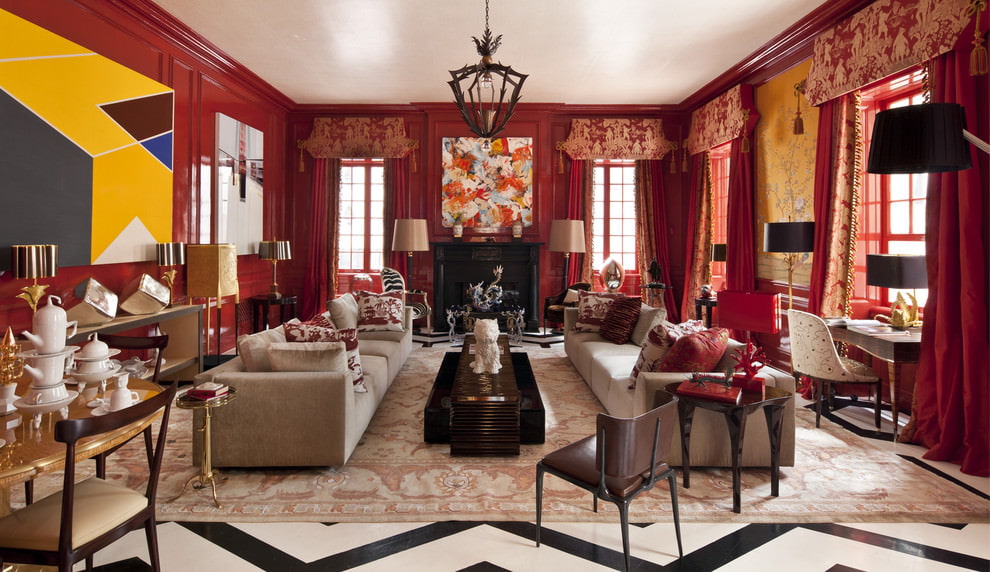
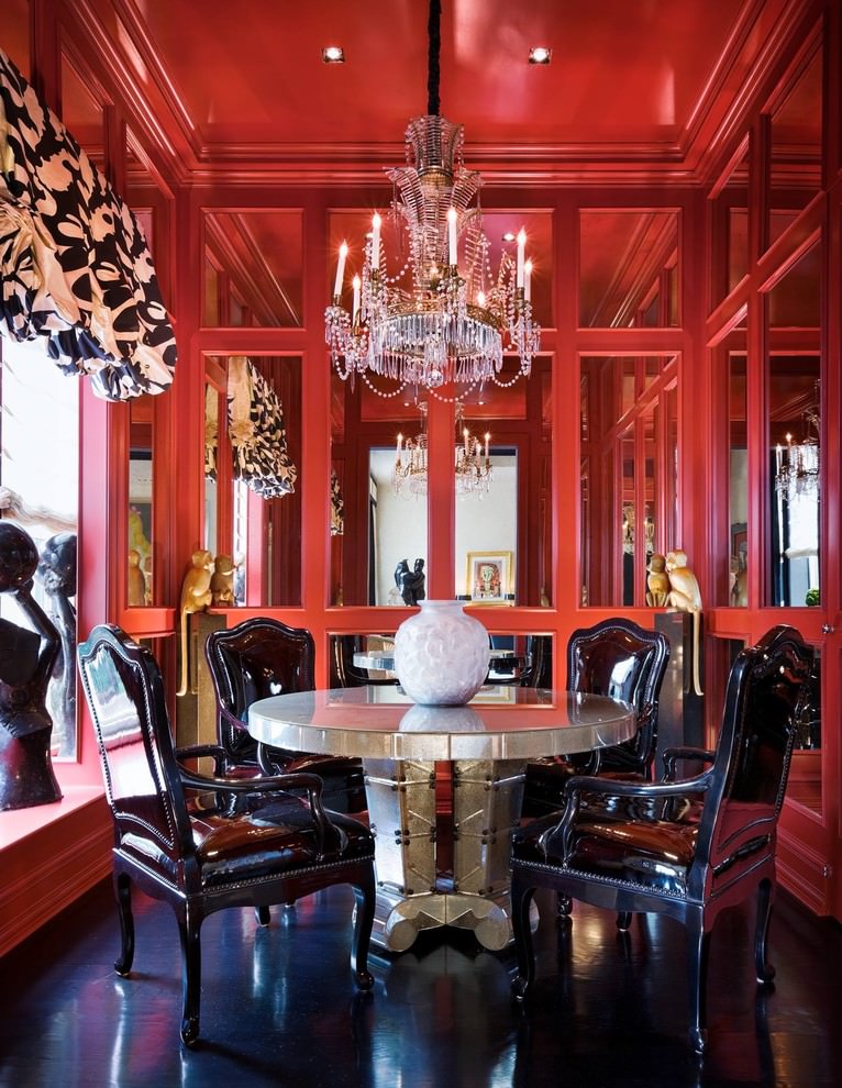
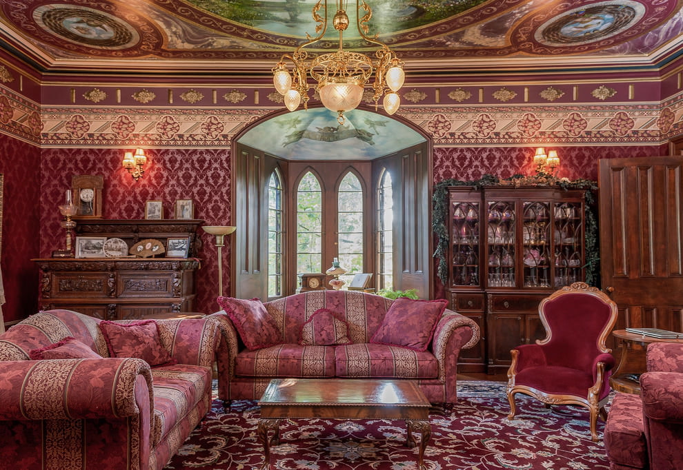
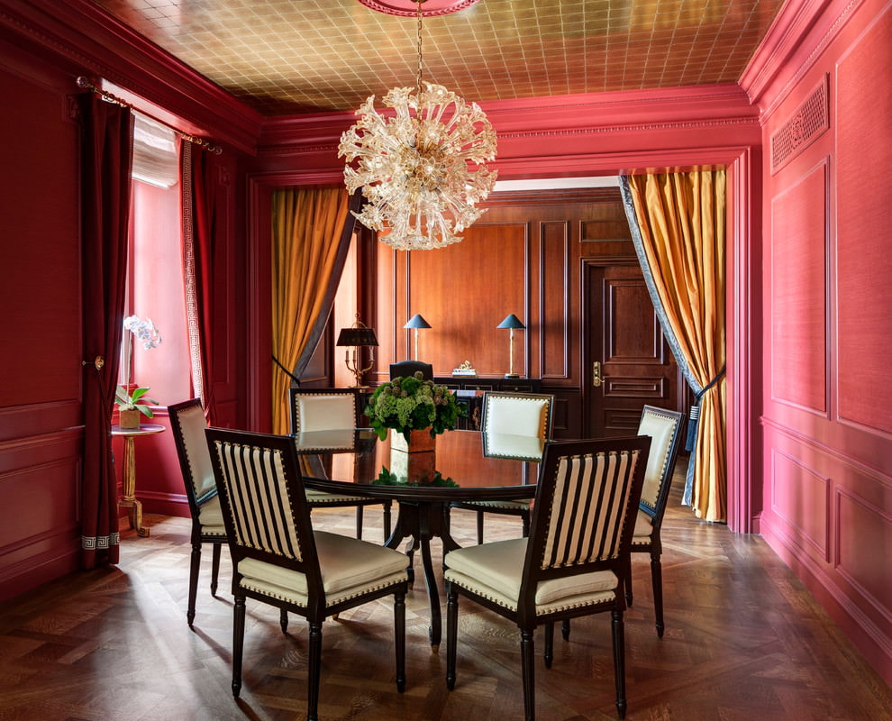
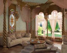
Crimson along with traditional is found in classics, baroque, and other historical directions. This is the color of kings and noble nobles. Together with brocade, velvet and other expensive heavy fabrics, you will be able to create a chic classic design.
Scarlet is suitable for impulsive and dreamy people. It is best used in the living room and lounge. But remember that he can tire, and do not overdo it.
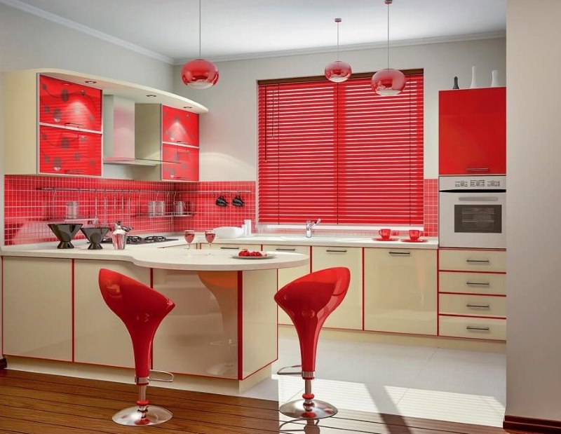
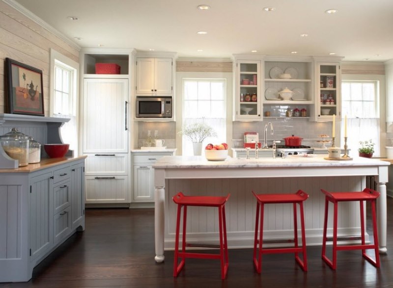
These scarlet chairs fit perfectly into the white facades of the kitchen
When choosing a color scheme, we suggest taking into account the summary table of the use of the main spectrum.
| Hue | Roomsbut | Most suitable style |
| Classical | Kitchen, Hall | Hi-tech, modernism |
| Terracotta, redabout-brown | Living roombedroom | Loft |
| Pink | Children | Any design suitable for a nursery (Provence is often used) |
| Scarlet, fiery | Bedroom, living room | Minimalism, Art Deco |
| Bordeaux | Hall, kitchen | Baroque, historical motifs |
| Cherry | Kitchen, bathroom | Classic, high tech |
Cherry shade will add solidity and solemnity to the design of the room
Next, we propose to analyze in detail the methods and scope of these and other, not so common shades.
It is used in many directions, both in the latest and in historical. The choice depends on the gamut available. After all, every tone creates an appropriate mood. To your attention the most popular and suitable styles for applying red in the interior.
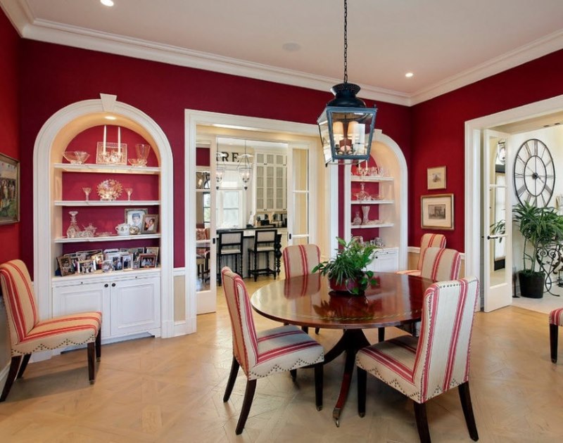
Classics are characterized by calm and smooth lines. However, burgundy and cherry are often used here. An especially frequent guest is the latter. distinguished by a special depth, he can make a calm environment. Also here we will meet a Bordeaux. This proud and elegant tone has long been a model of classics, having the opportunity to make an exquisite atmosphere.
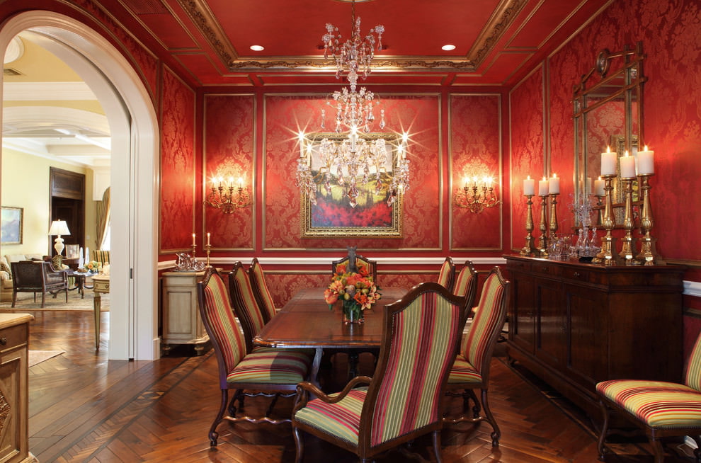
In the classic interior, red is combined with olive, golden and emerald colors.
Different shades in the classics are realized mainly in textiles. Thick maroon curtains, a tablecloth on the table with appropriate patterns, a carpet with an ornament of this color. These details will well emphasize the classic style in the interior.
Historical motifs are gaining momentum, transforming into modern design. The most common are the Renaissance and ancient Greek movements.If the second is characterized by calm and the prevalence of light cold notes, the first is an eternal holiday and luxury. Here you can’t do without a fiery mood.
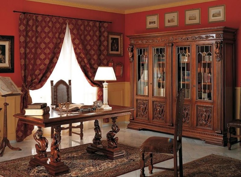
Refinement of wooden furniture and restraint of red walls
The most popular is the red-gold color of the decor in the interior. This is a business card of style. It is also realized mainly in large details, such as carpets, curtains, sofa upholstery, pillowcases, etc.
The greatest application of the direction is found in the design projects of the bedroom, living room and hall. In other parts of the apartment, it may be less pronounced.
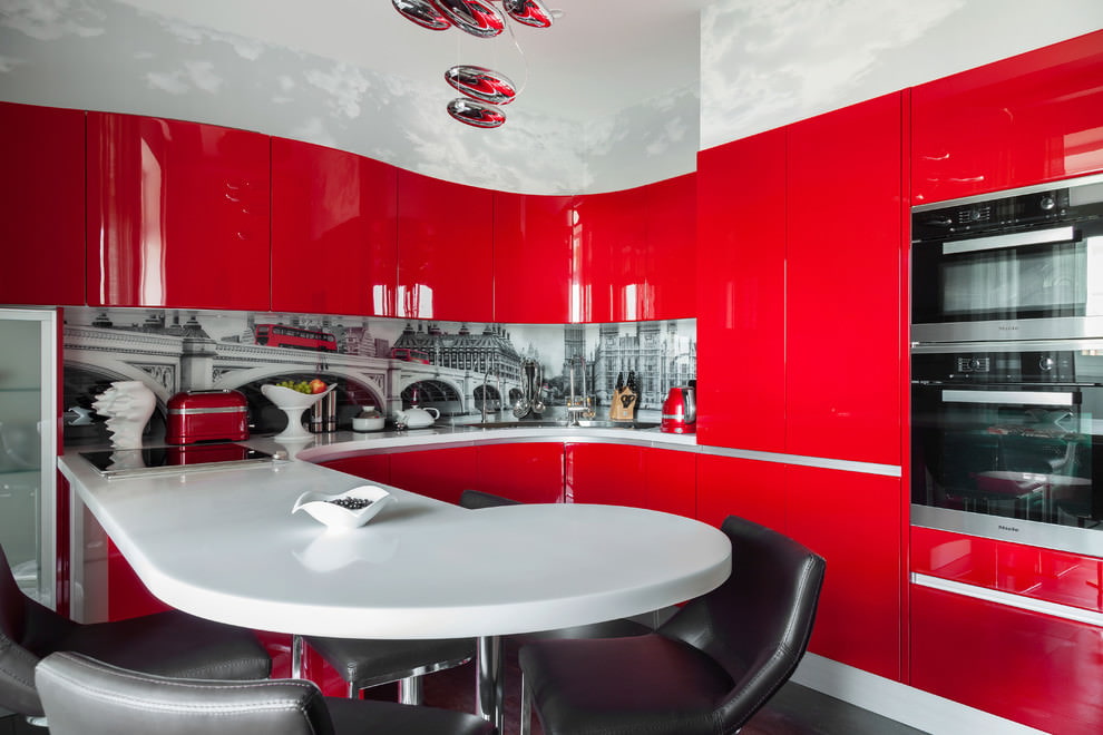
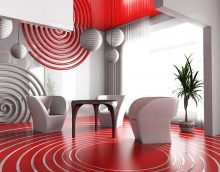
Red color in the interior of minimalism is a frequent occurrence. In view of its strict orientation, complete coloring of surfaces in this way is already encountered here. Light and bright colors are more acceptable here. Scarlet, purple, traditional, fiery - all of them are welcome.
Minimalist red bedroom
Current trends offer an interesting trick - painting one wall. It can be found in any of the rooms. Thus, you will be able to highlight one of the functional areas, put a bright accent and visually increase the space.
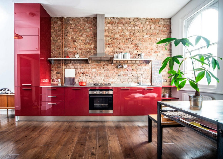
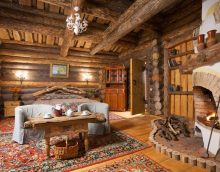
Another relevant area, accepting the proposed color. However, it is more restrained, and loves dark moods. Therefore, for the loft, select shades that are close to brown.
This trend, like many current trends, is characterized by features of minimalism. Here you will not see many small details or murals. Plain wall covering, urban motifs and rude features - features of the loft. Therefore, the colors need to be selected appropriate.
In a loft, a combination of red, gray, white and black in various proportions is appropriate
They can be sold in wall or (less commonly) ceiling coverings, furniture and textiles. Remember, the loft loves rough features, minimalism and dark notes.
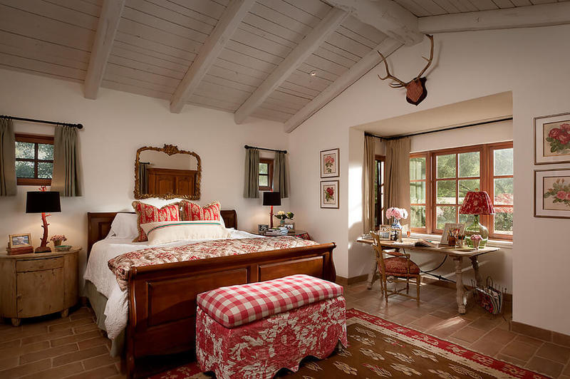
These two areas are very similar. Only Provence is more tender, soft and calm. One of the details that unites them is the red gamut. The whole spectrum has taken root here, it is only being implemented in various details.
In country, there is always a tree that combines well with all shades of red
Since these are ecological trends, we will see an abundance of wood in each project. Looks great mahogany in the design of the living room. Also, the corresponding colors will help to support various little things.
In both styles, much attention is paid to textiles. In the kitchen and in the living room is found in abundance and plays an important role. The prevailing tones of both styles are calm, therefore, the considered one realizes itself in detail, in the textile it also partially manifests itself, combined with the main ones.
Red in the interior is quite difficult to implement. However, it is suitable for any room, in each case individually embodied in different details. We offer an overview of areas where this option will be most appropriate, and also describe how and at what points it can be applied.
Any shade of red is impossible not to notice, even if it is in the interior as only one detail
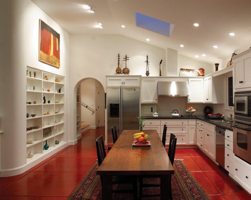
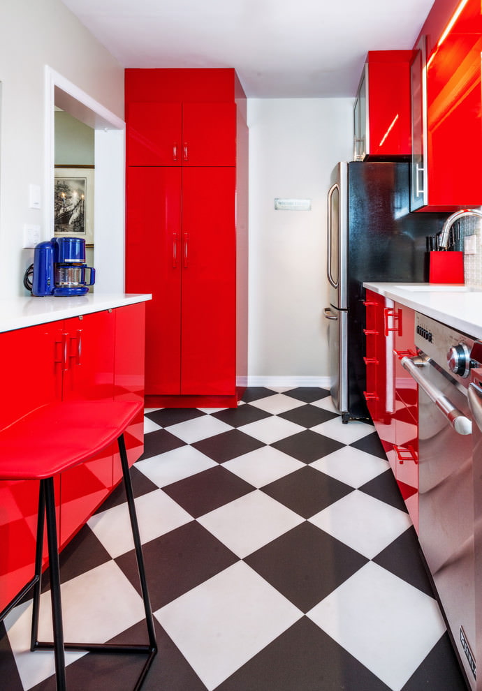
Much depends on the style that you have chosen to design this space. It determines the color of many surfaces. But the functionality of the room is also of great importance. Agree, the pink kitchen looks a bit ridiculous. But Bordeaux, cherry, terracotta and purple are widely used in the kitchen space, and have proven themselves well.
The warm atmosphere in the kitchen is dominated by red, the combination of which with green tones was invented by nature itself
Relating to the warm gamut, it stimulates the appetite. For this reason, he is an excellent guest for the kitchen. If you want to add a cool touch, and not really warm your appetite, choose purple, as it has an admixture of blue.
The most suitable application for this spectrum is the color of a kitchen unit, an apron (i.e. a work area) and furniture upholstery.
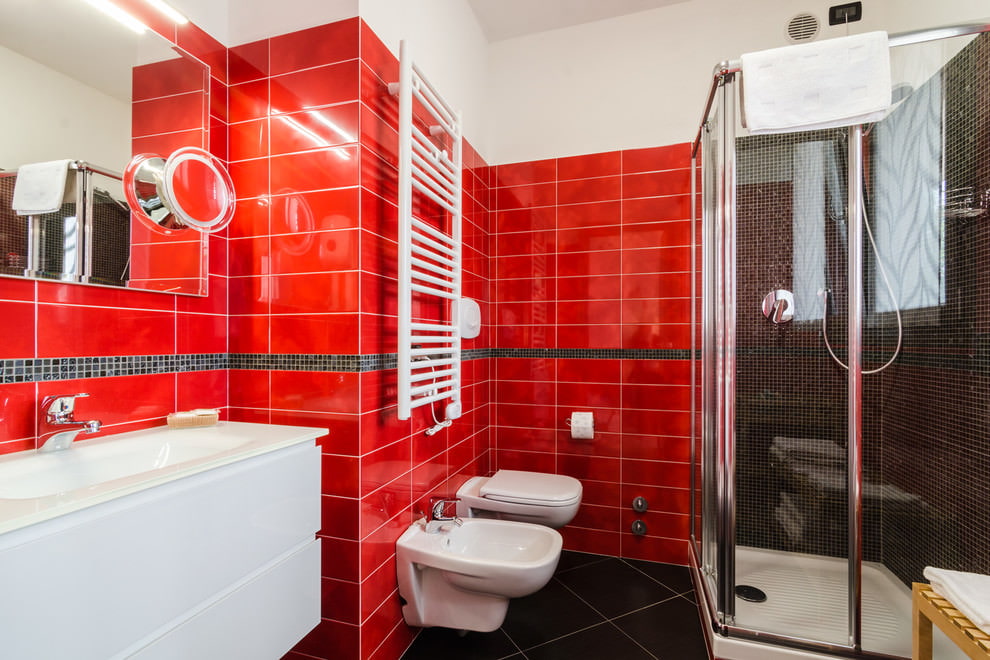
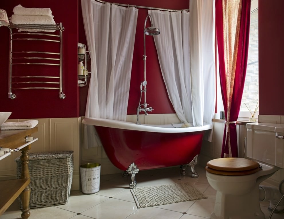
Make a few bright notes in a room where there are no windows - not superfluous. For this purpose, select mainly light colors. Bordeaux is also found, but for its use, the bathroom should be large.
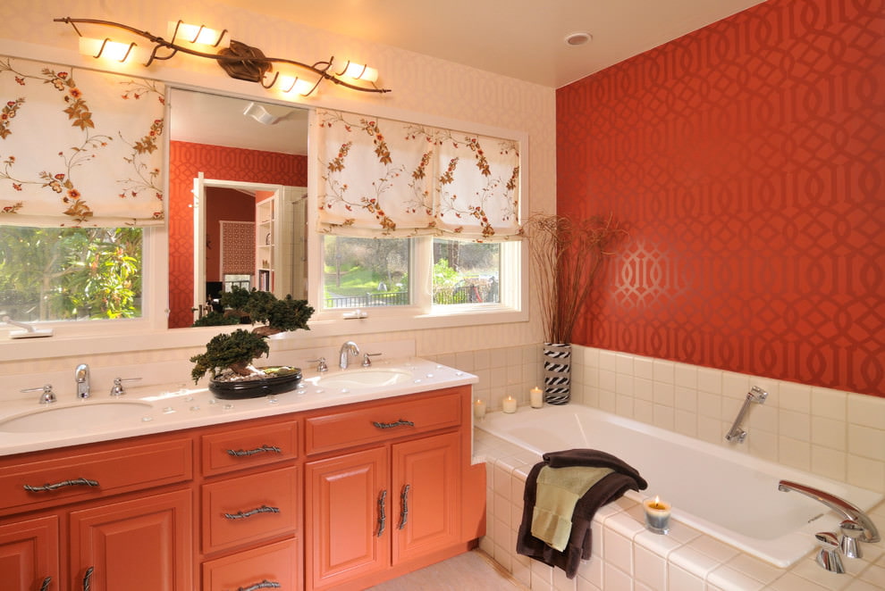
Red and beige bathroom interior
For this room, the technique of highlighting one bright wall is excellent. You can also find the embodiment of the proposed idea in furniture and plumbing, picking up a bathroom bowl, cabinets and cabinets using one of the shades.
In the market you will find many models of tiles with red splashes. It can be used for flooring or wall cladding. It is advisable to leave the ceiling light neutral.
Here the spectrum is not limited. Choose any shade you like, and boldly bring it to life. In this case, the chosen style, personal preferences and dimensions of the room play a decisive role. Pay attention to the height of the ceiling, the configuration of the room, and the amount of sunlight entering through the windows.
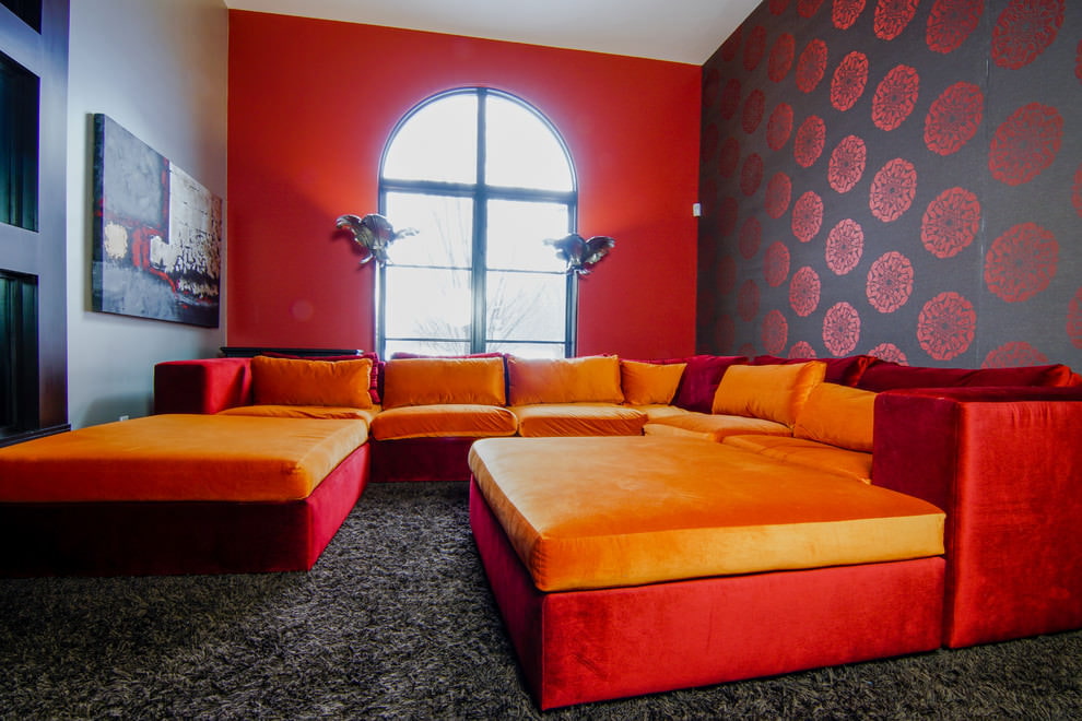
The interior of the living room will be more dynamic if you use smooth transitions from shades of red. For example, you can add upholstered furniture
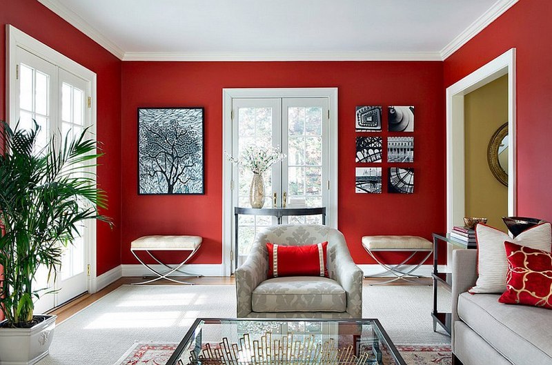
Here you can paint the wall completely in one of the elements of the main gamut. A darker and calmer tone is best, since an abundance of bright and rich notes can tire, cause discomfort and even aggression. In general, for the living room, this color will bring a positive mood and freshness.
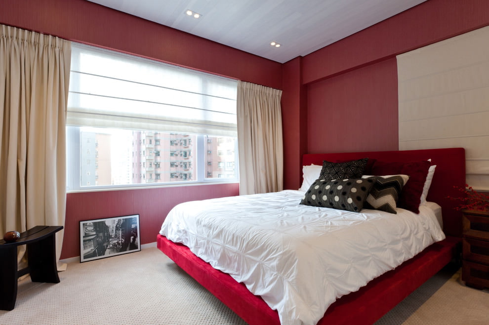
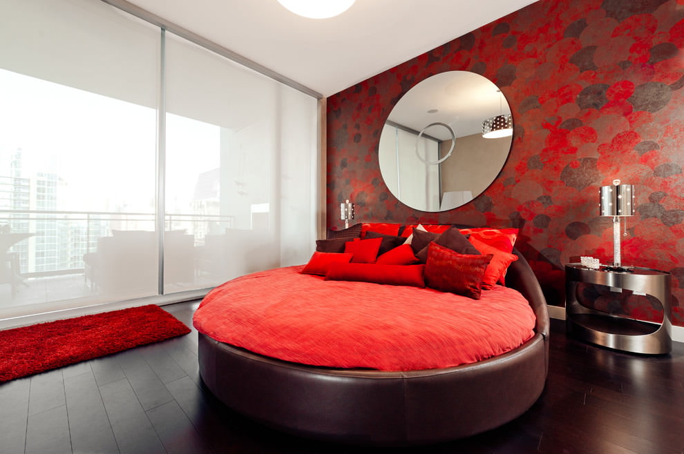
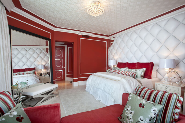
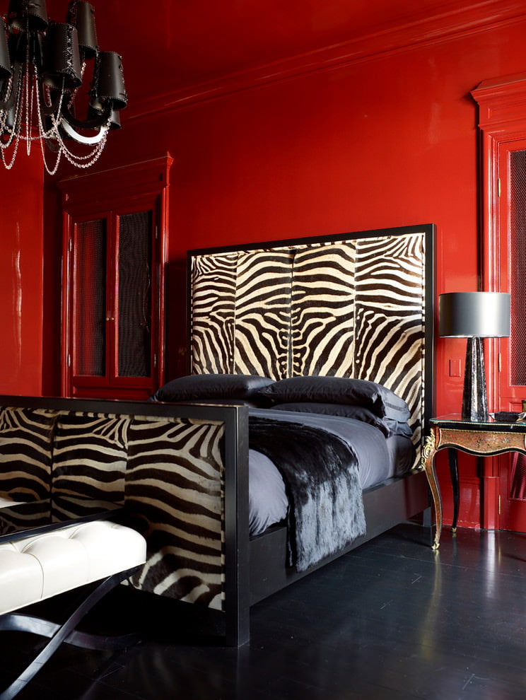
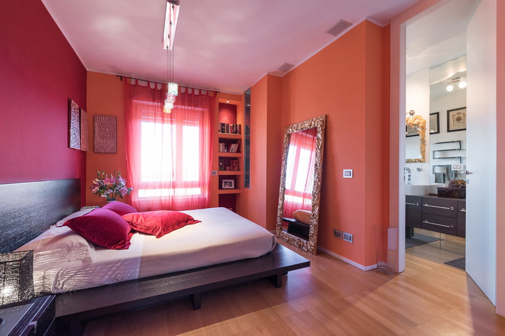
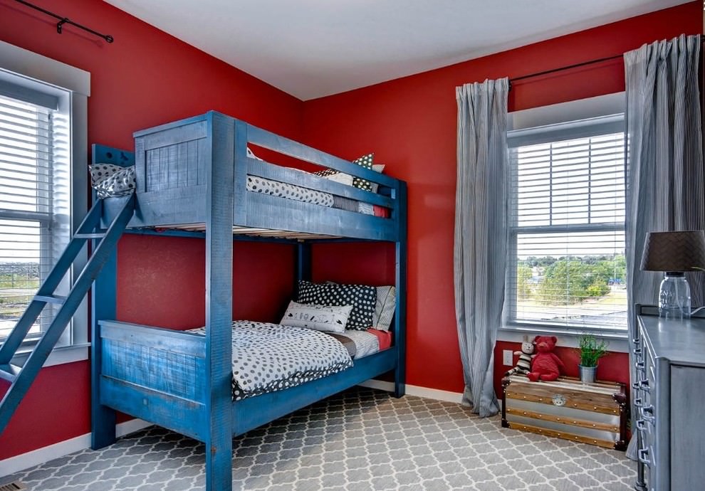
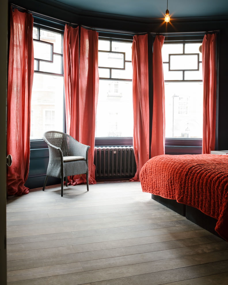
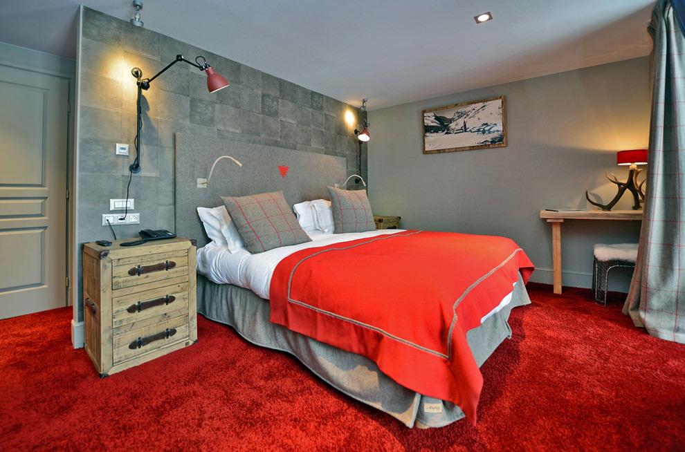
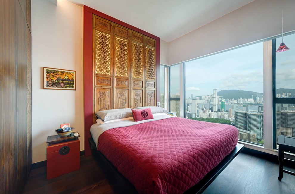
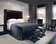
In this case, you need to remember that the abundance of flashy flowers in the bedroom is unacceptable. But small splashes of bright details will only benefit.
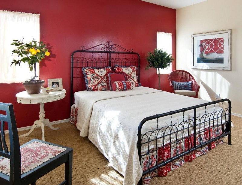
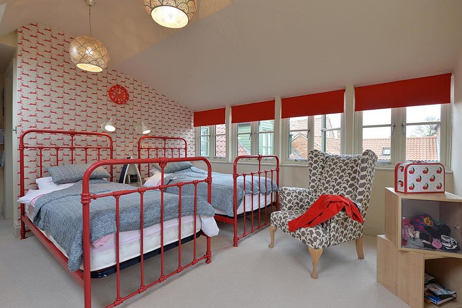
In the bedroom, red is suitable for highlighting the accent wall behind the head of the bed
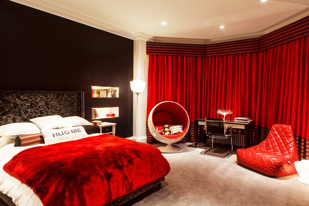
Red is a symbol of love and passion. It can excite an intimate atmosphere and bring to proximity. For this reason, it is used to design a sleep zone. Bed linens, pillows, paintings on the wall above the bed - all this can be involved.
As a complement, create spotlights with red diodes that turn on separately from the general light. This will help to create a passionate mood and promotes relaxation, which is very important for the bedroom.
We partially touched on the topic of the embodiment of the proposed spectrum in the elements of different areas of the apartment. We offer to find out more details, and summarize the existing knowledge.
A good place for red can be found almost everywhere
For flooring, wood and tile are used. With both options, it is possible to create a red interior. Only in the first case it will be darker, especially if you use natural wood. In the second case, you have a wide selection of colors. The most popular was ceramic tile. Choosing this option, you can independently choose any color. It is worth noting that granite and marble are somewhat limited in this regard, as these are natural minerals with their own unique color.
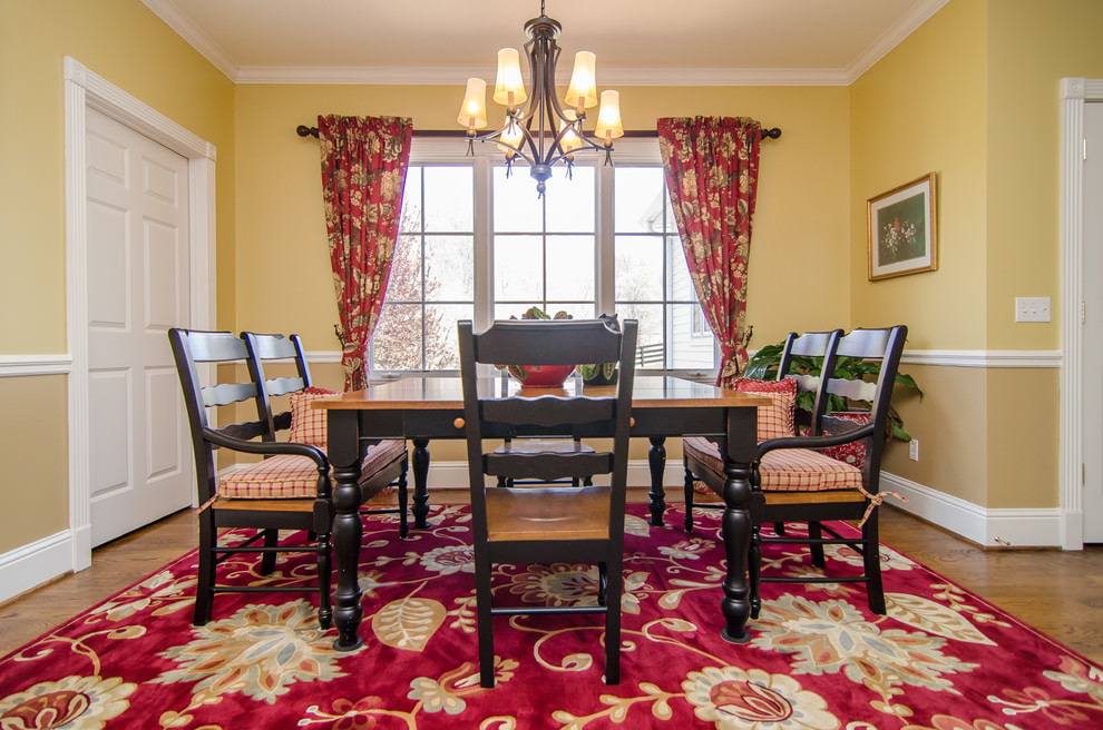
To add coziness and warmth to the dining room atmosphere, just lay a carpet with patterns
For walls you will find many options. In the assortment of current masters, paint as a coating is widespread. You can paint the walls monotonously, as well as make any pattern with brushes, stencils or spray paint. Wallpapers also offer many options. You can choose plain wallpapers, and combine them with each other; pick up models with patterns or murals. Everything is decided by your imagination.
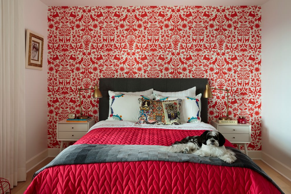
Red wallpaper in the bedroom
It is rarely used for the ceiling. In this case, it will visually make the room smaller, and can also negatively affect a person’s mental state.However, there are design options using burgundy ceiling or dark impregnations. To do this, it is better to choose a PVC film, that is, to perform the lining using the "stretch ceiling" technique.
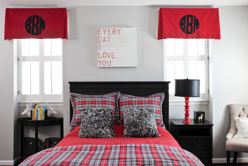
Textiles are the most favorable area for implementation. In the bedroom, color is realized in curtains, upholstery and bedding. This is a great option. Scarlet curtains will add freshness and spaciousness, if you choose darker - comfort.
In the bedroom you can find an implementation in bedding, in the kitchen - a tablecloth, kitchen towels and napkins.
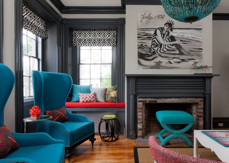
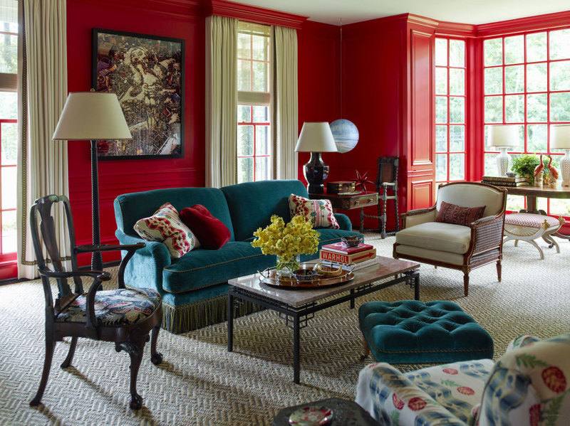
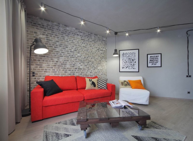
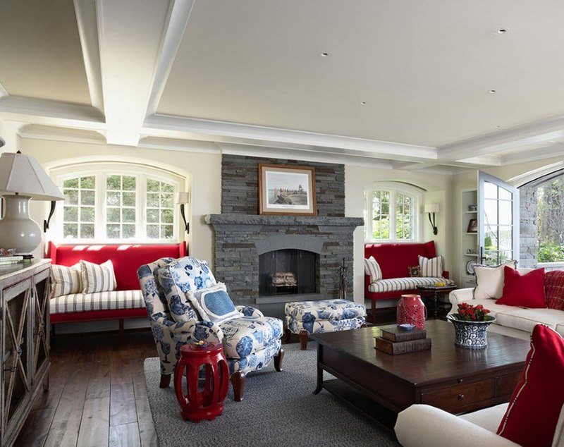
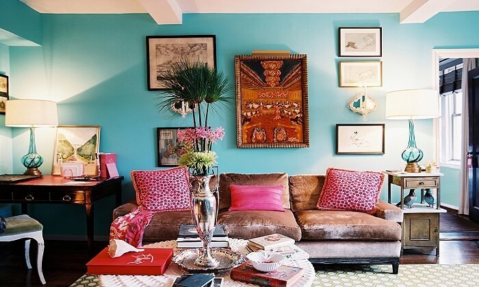
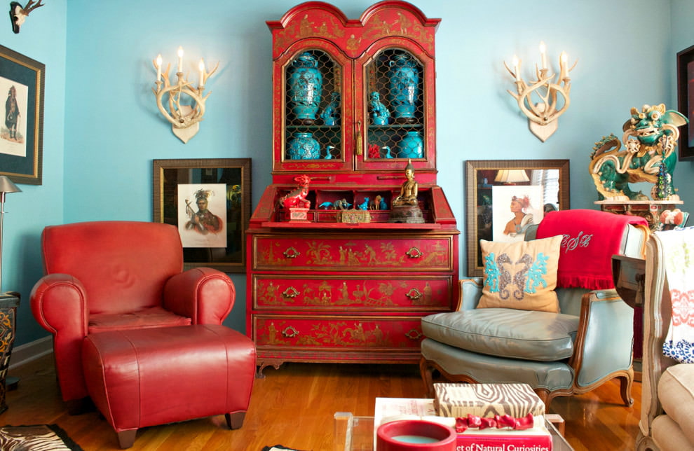
A pair of small splashes of red added harmony to the gray-turquoise interior of the living room
As decorations, paintings, figurines, photo frames and any manifestation of jewelry made by yourself are meant. They may have interspersed fiery inclusions. This is a good opportunity to highlight them and attract attention.
We examined the use of red in the interior in different forms. Now we will determine what he is friends with. To begin with, it is worth saying that it combines well with both the warm and cold spectrum.
The combination with pastel colors will provide a gentle and calm design. This option is well suited for bedrooms and kitchens. For such a combination, choose a calmer note. However, if you want to see a game of contrasts, fiery and beige look great.
The combination of red and beige creates a soft and calm interior, where red color adds dynamics so that it is not boring
Gray will also create a great pair. It will calm the stormy fiery, make it more matte and noble. The combination with black will be a real expression of passion and extreme contrast. This option is suitable for a kitchen set.
Golden will give a feeling of luxury and celebration. This combination is often found in bathroom renaissance and provence. Suitable for a living room with a historic design. But try to remember harmony so as not to get an overabundance of celebration.
A common white background is used to neutralize the cold of blue and the heat of red.
Of the cold, a good pair will be blue and green. Combine the shades and you will get a truly authorial and unique design.
To summarize, let’s say that red can be used everywhere in the interior. However, you must be careful, remembering the rules and tips outlined above, do not overdo it with bright colors.


Thank!
In the near future we will publish information.