0 photo
A small standard kitchen is inconvenient, but with the advent of studio apartments, it became possible not to limit ...
The design of a modern kitchen should be such that it would be desirable to cook with a creative approach and to communicate with family and friends for a long time, even if it is a cup of tea with cookies. The combination of colors in the interior of the kitchen affects the atmosphere in the house and mutual understanding between loved ones. When choosing, it is important to rely not only on personal preferences, but also on general perception. Harmony will prevail if you apply the basic rules of companion colors and combine them according to the color wheel scheme.
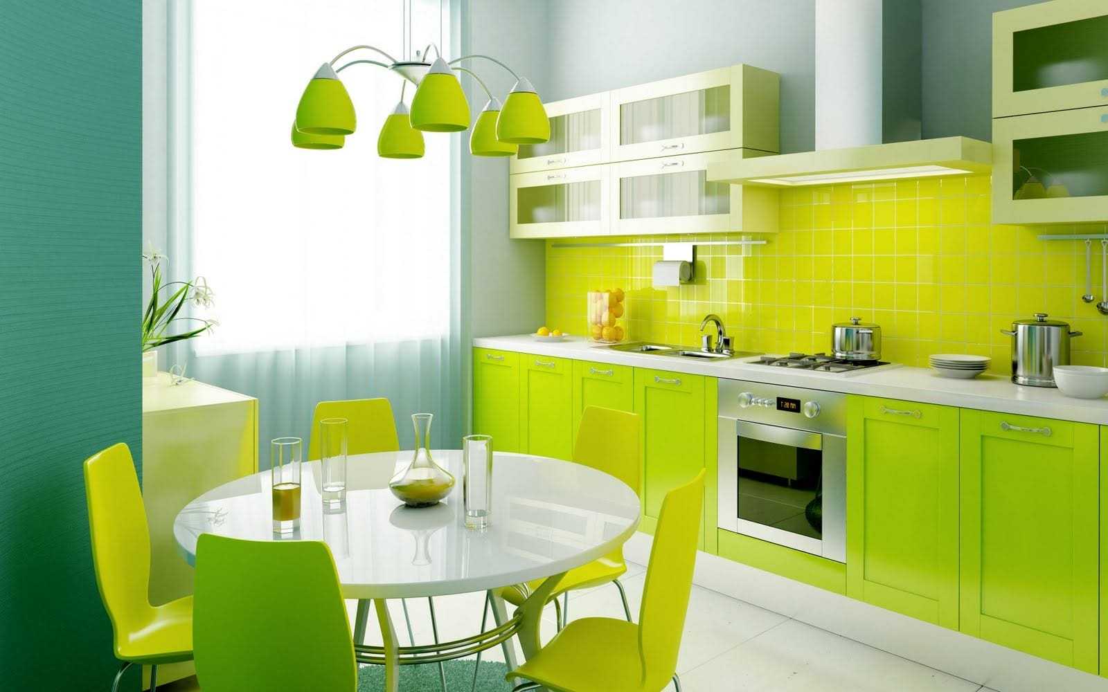
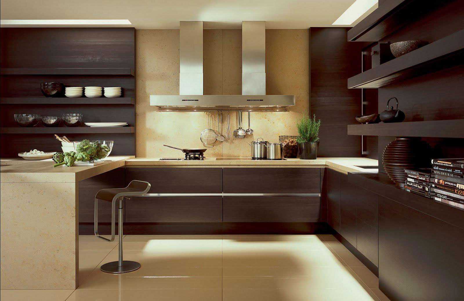
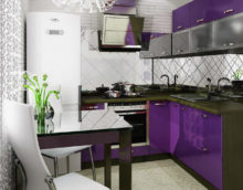
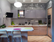
The interior of the kitchen in a combination of different colors
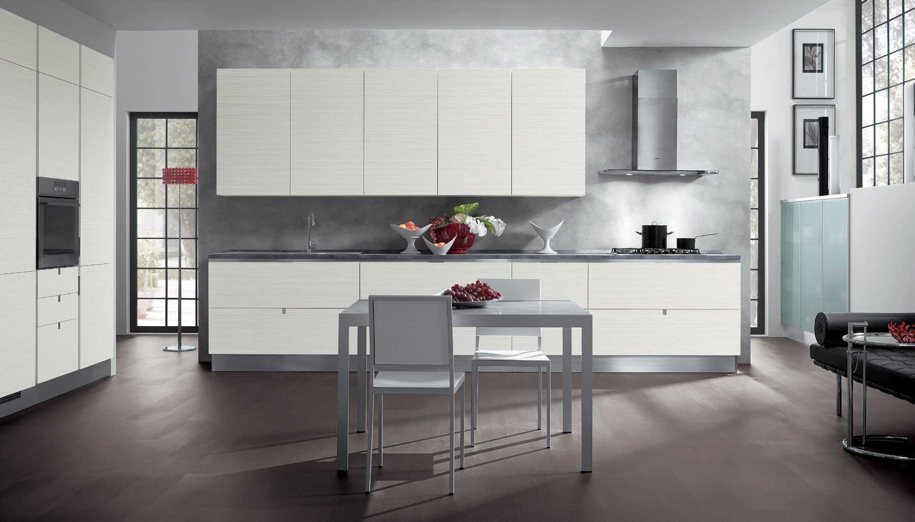
Modern kitchen design in a combination of colors
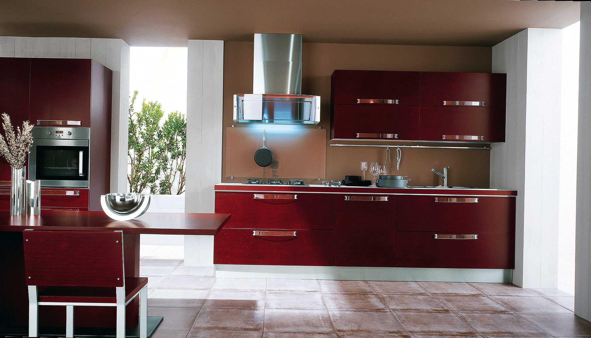
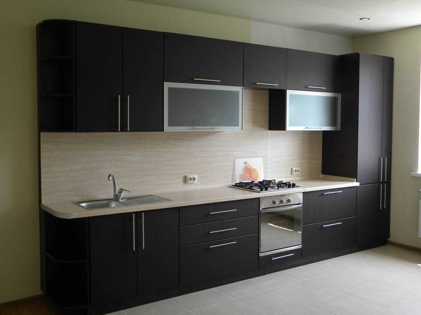
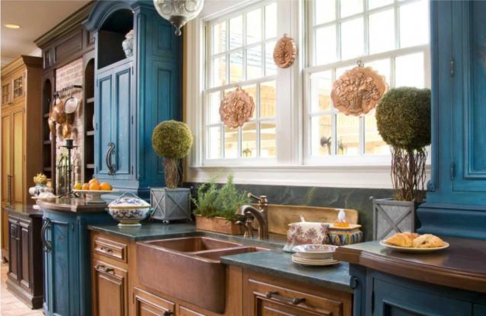
Dark colors in the interior of the kitchen
Table of the classic combination of shades:
|
1. White |
Great background for most combinations |
|
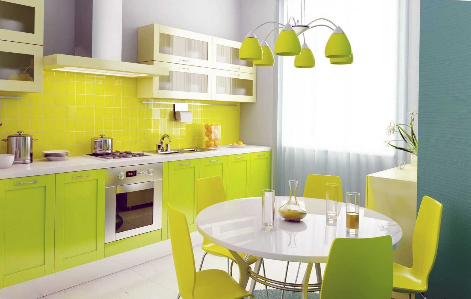
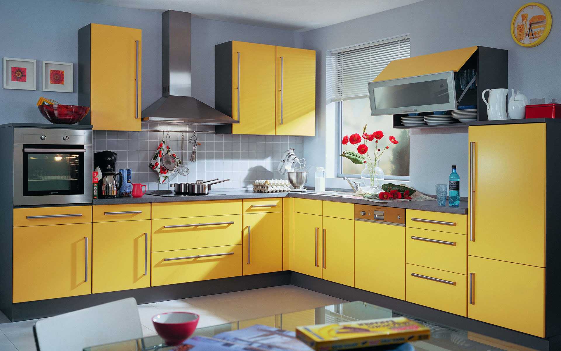
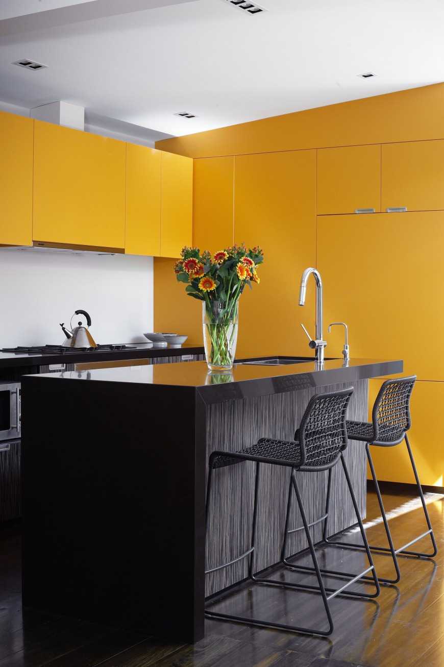
2. Yellow |
With green, black, purple and brown |
|
3. Beige |
With milky, brown, red and green |
|
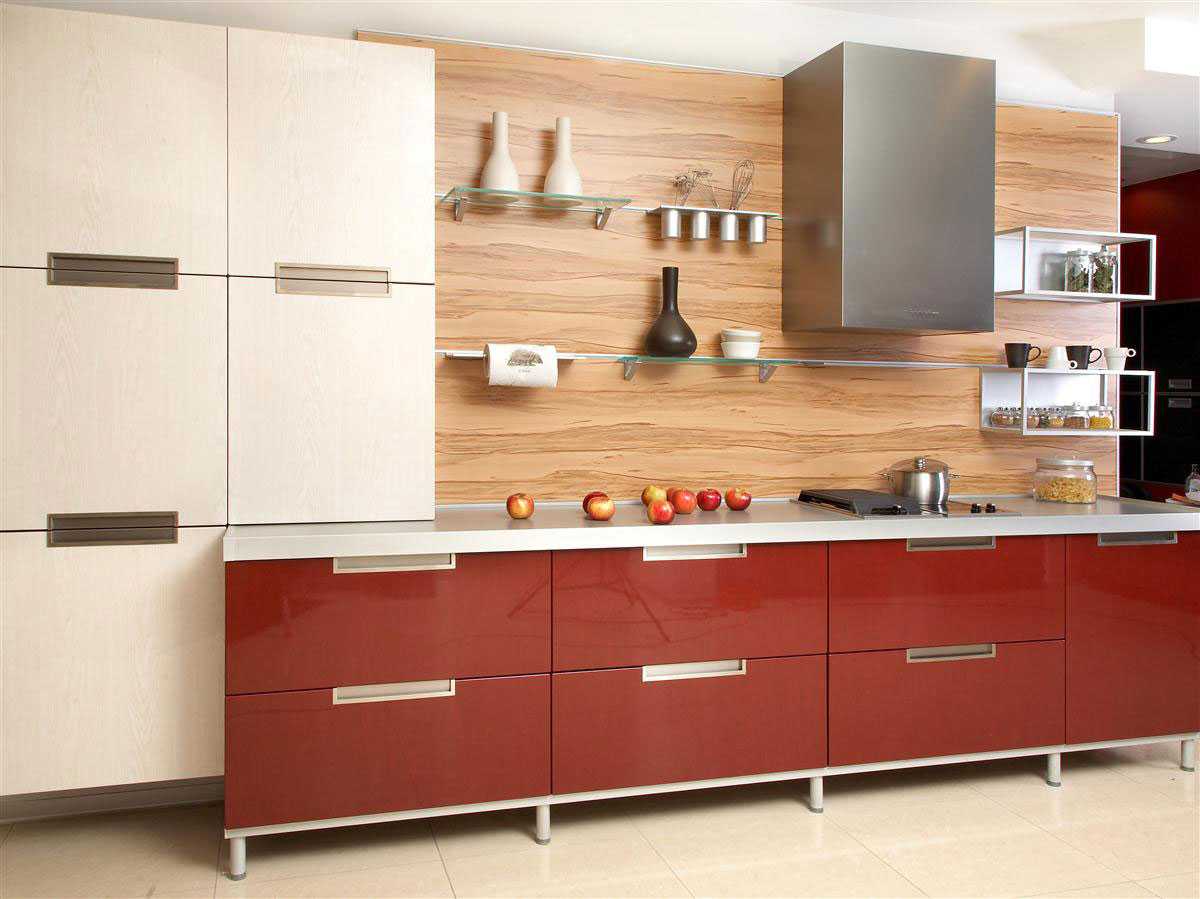
4. Red |
With white and blue, beige, gray and black |
|
5. Pink |
With raspberry, purple, white and blue |
|
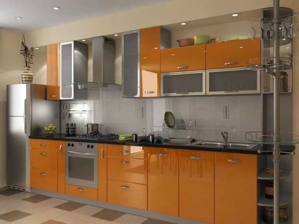
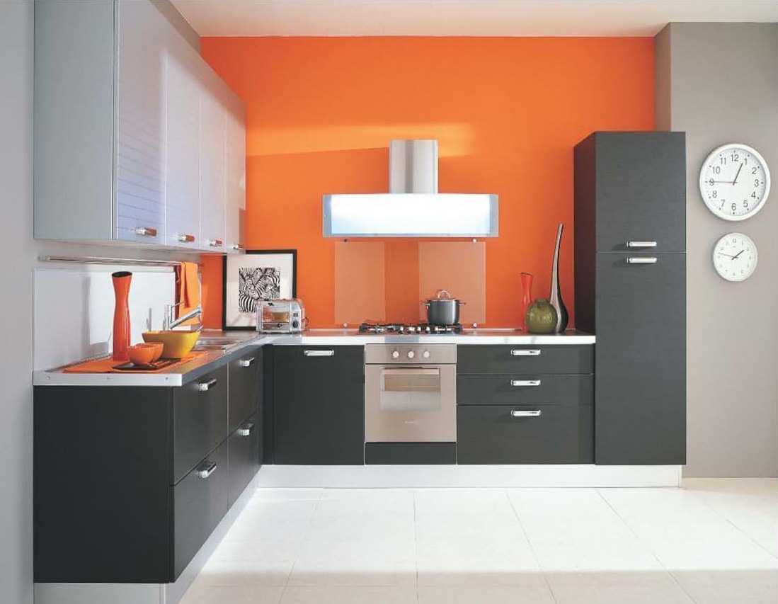
6. Orange |
With white and black, green and lemon |
|
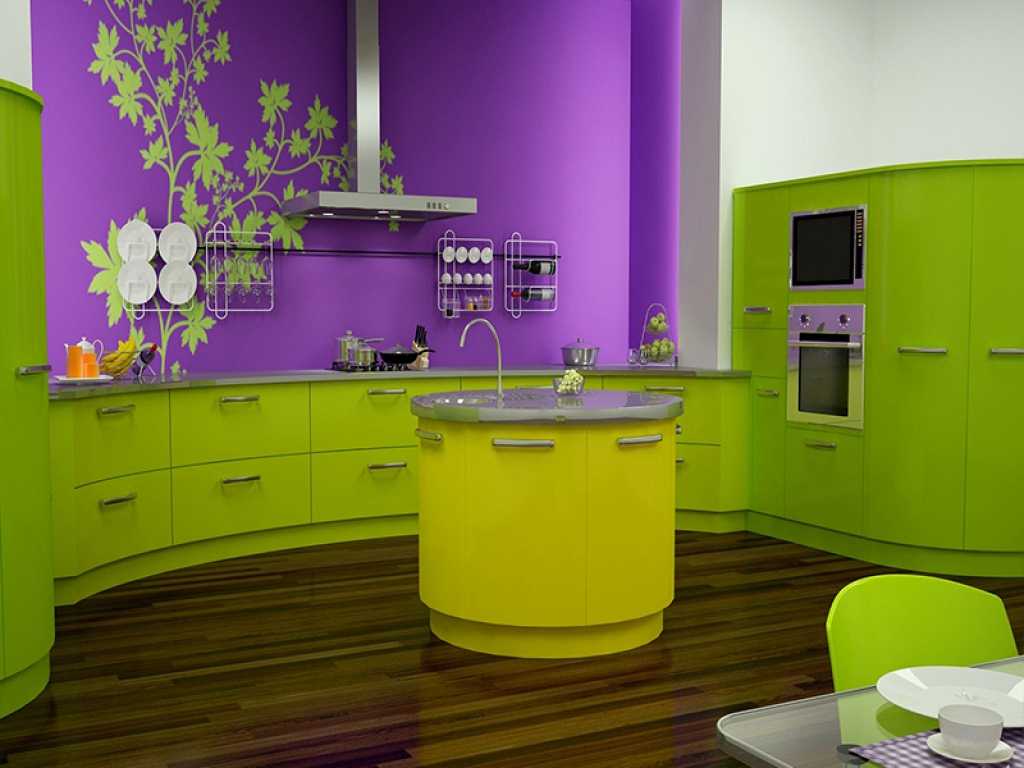
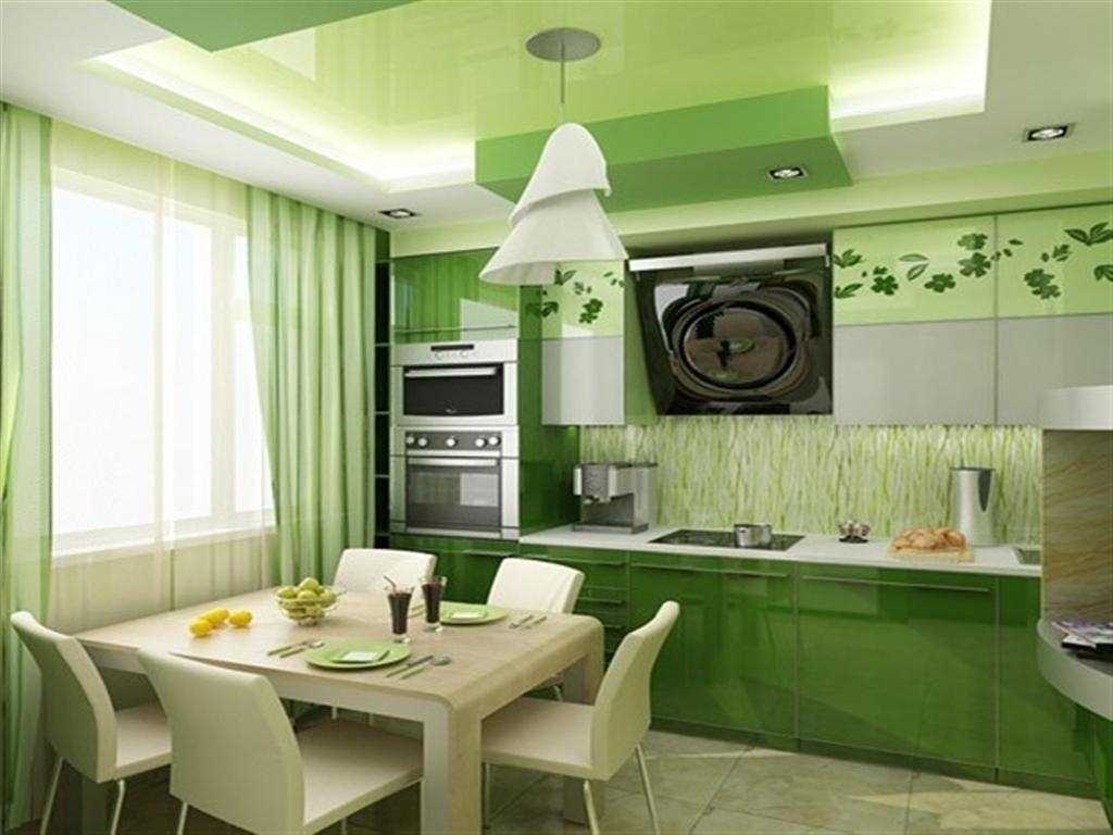
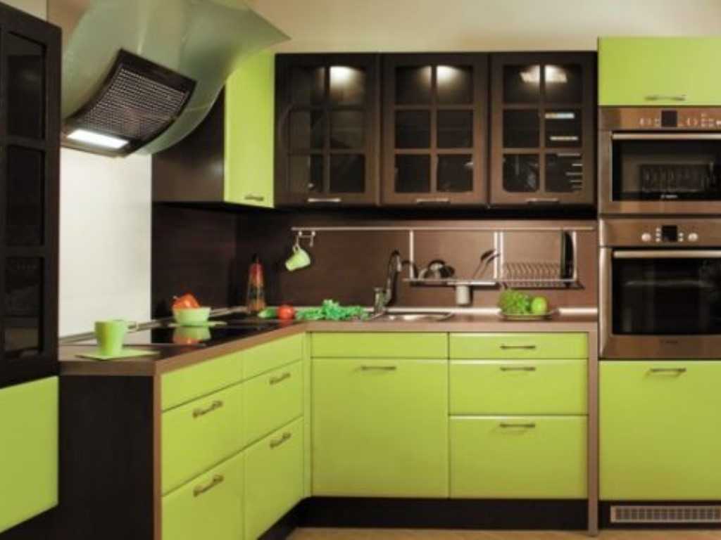
7. Green |
With yellow, brown, green and beige |
|
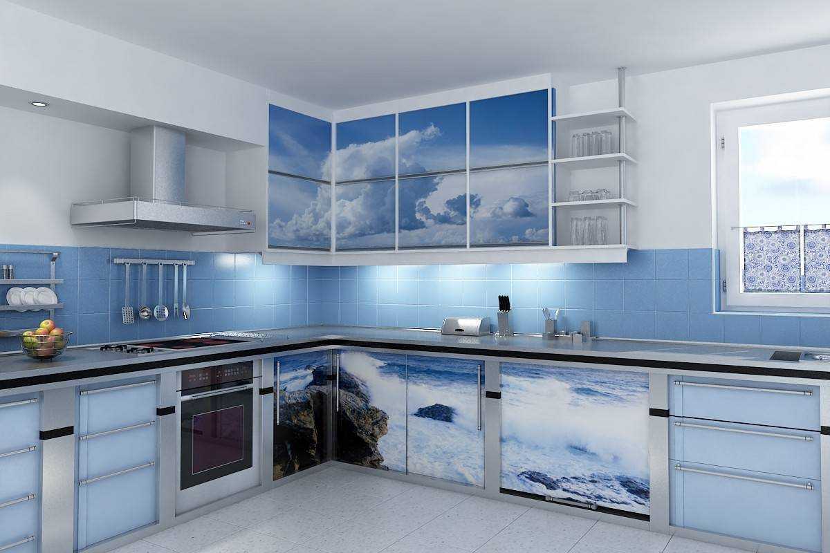
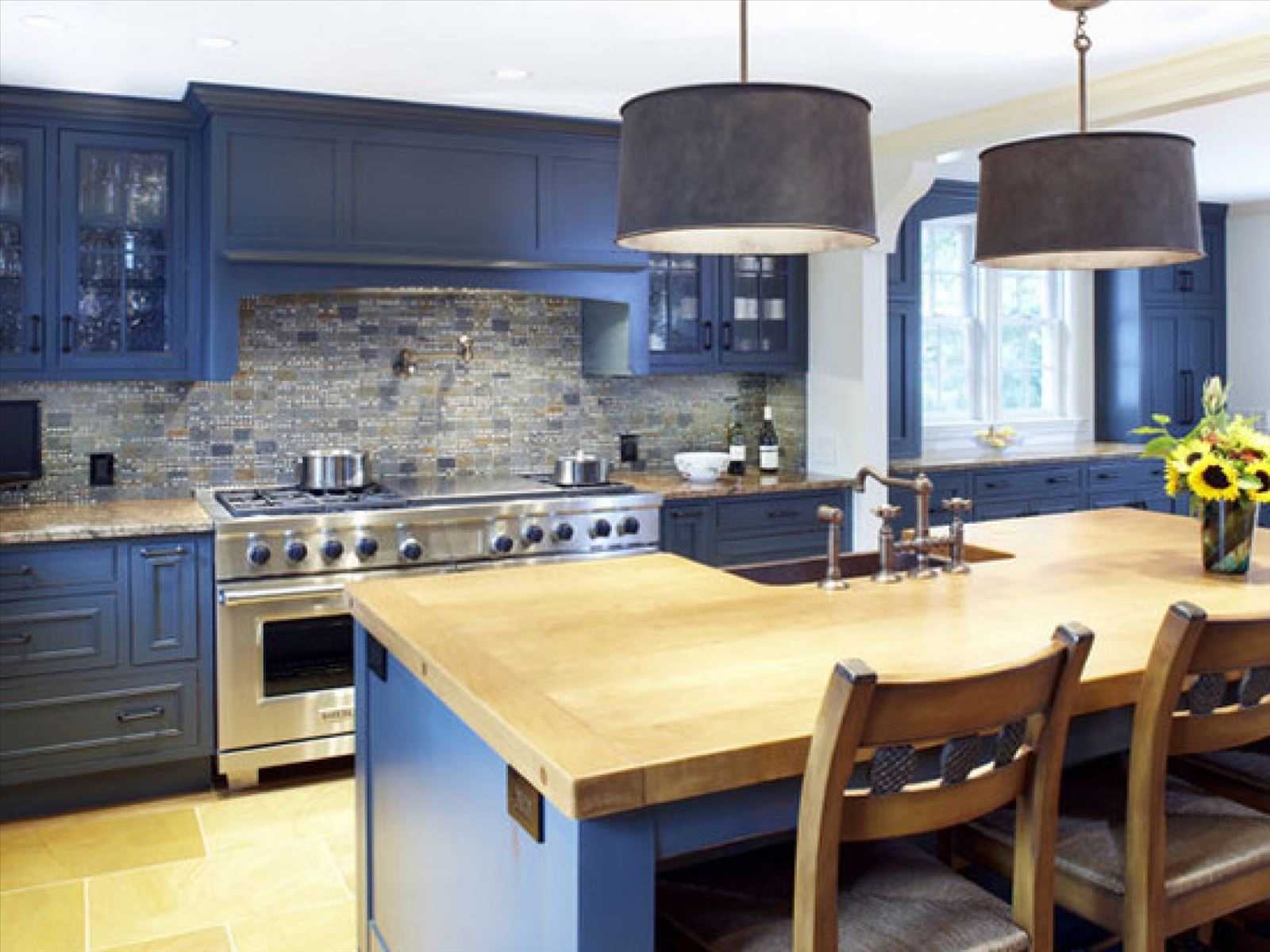
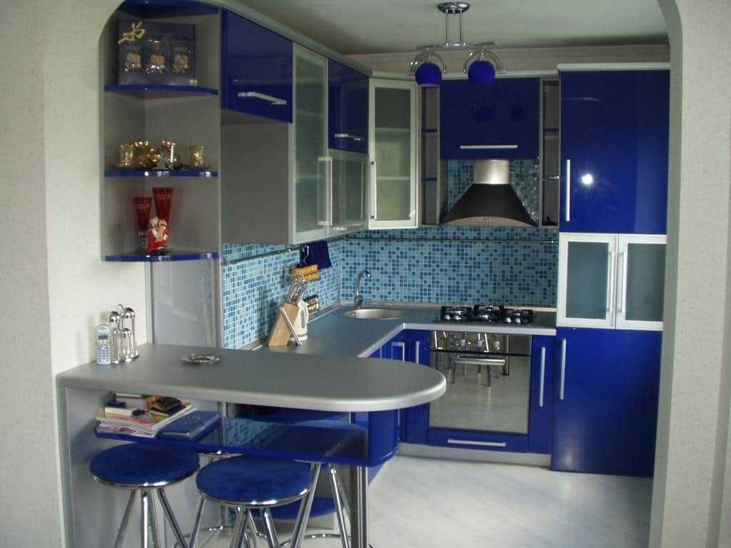
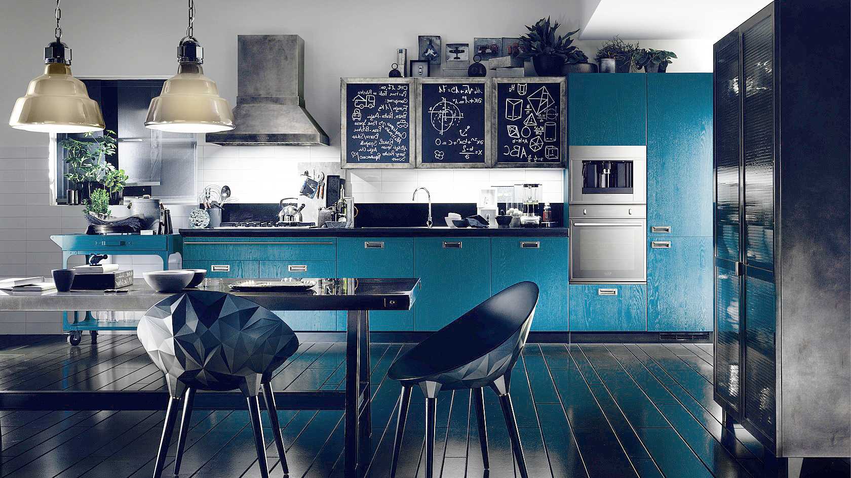
8. Blue |
With red, blue, white, turquoise and lilac |
|
9. Brown |
With beige, milky, red and green |
|
10. Gray |
With red, blue, white, olive, purple |
|
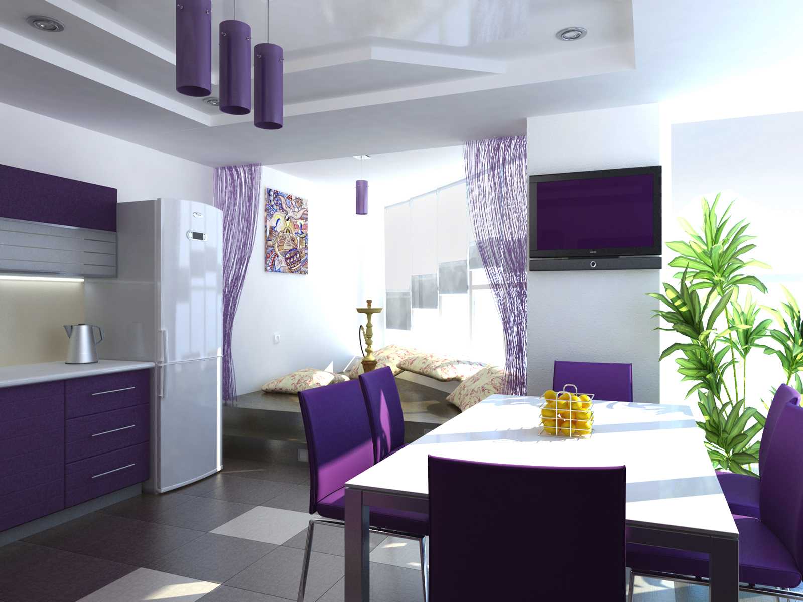
11. Purple |
With yellow, lilac, white, pink and blue |
|
12. Black |
With most saturated and light shades |
In the interior of the kitchen, classic color combinations are often used, but there is always room for bold experiments if there is imagination and a sense of proportion. It is important to consider subconscious perception. For example, if violet is associated with loneliness, and red is associated with aggression, it is better to replace them with something more optimistic.
Traditionally, the lower plane is made darker than the walls, and the ceiling is light. A black stretch fabric with diode illumination looks extravagant, but in an apartment with low ceilings there is often a feeling of overhang or pressure from above. The blue ceiling, on the contrary, creates the illusion of an open sky, it can be supplemented with a picture of light white clouds.
A feeling of reliability and solidity gives a brown floor, regardless of texture. Moisture-resistant laminate with imitation of natural wood can be laid not only along or across, but also diagonally. This visually increases the area of small kitchens.
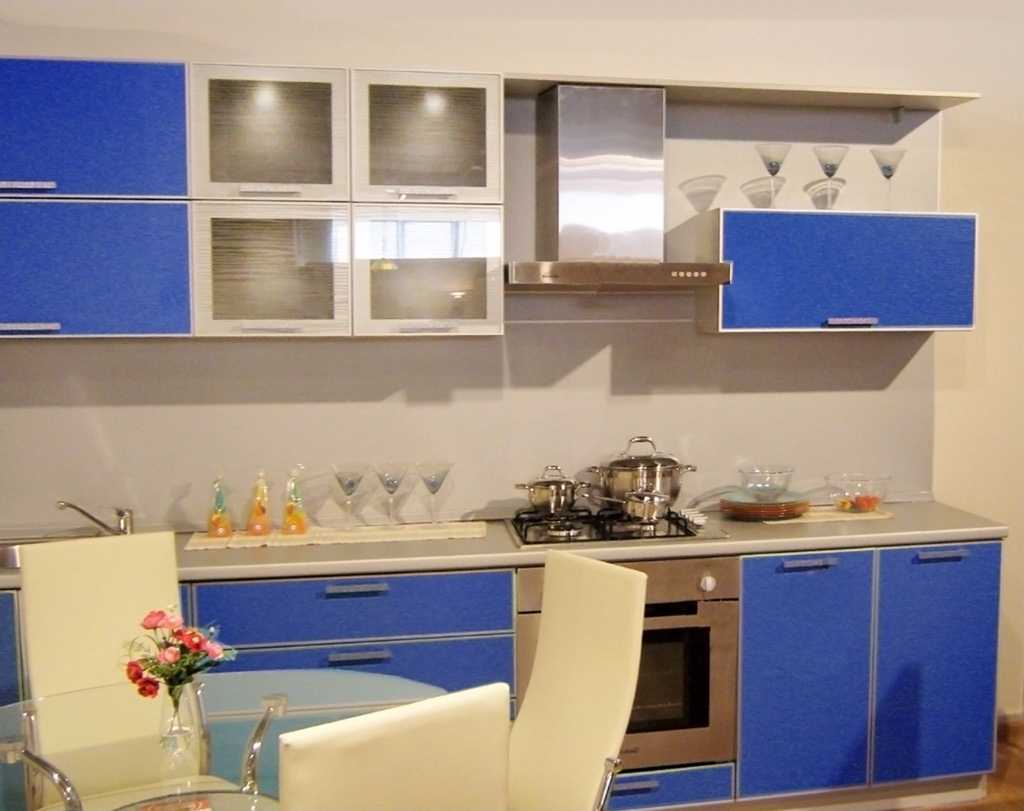
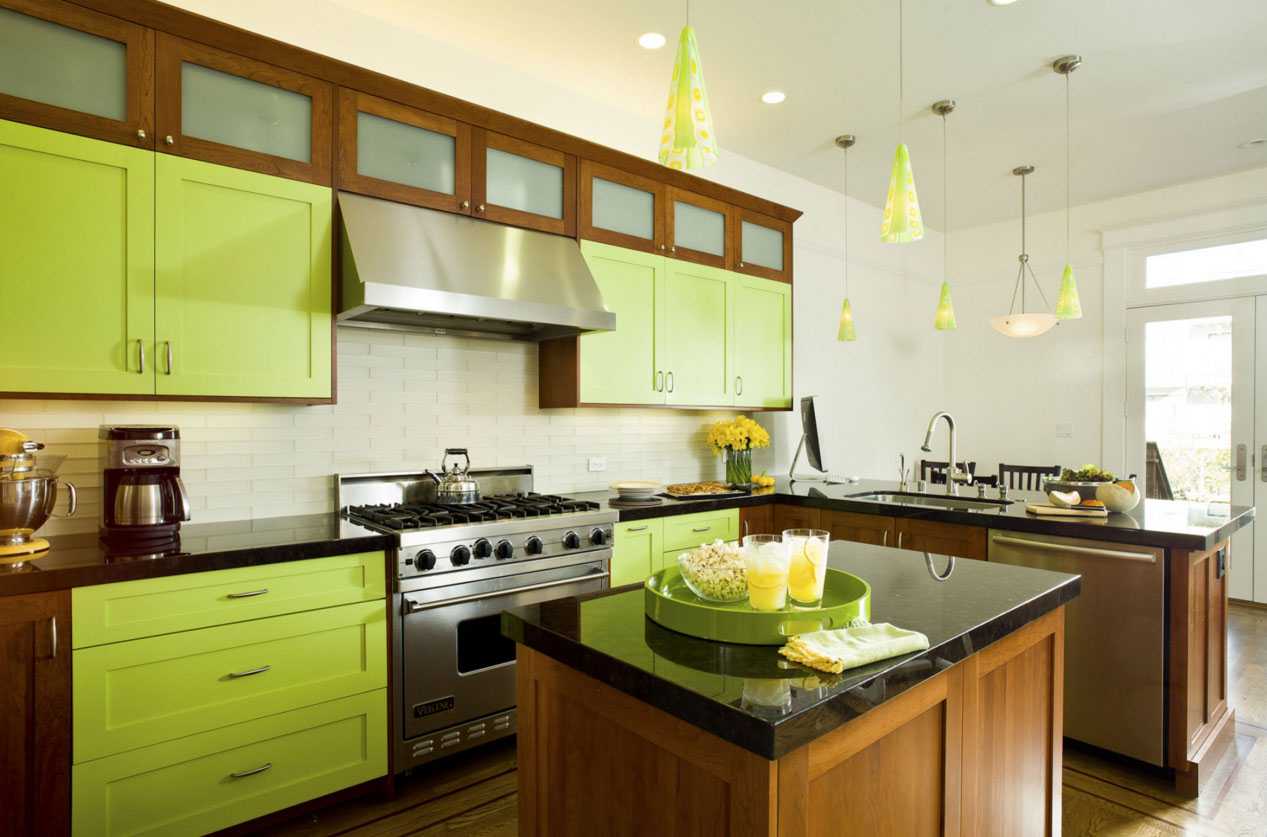
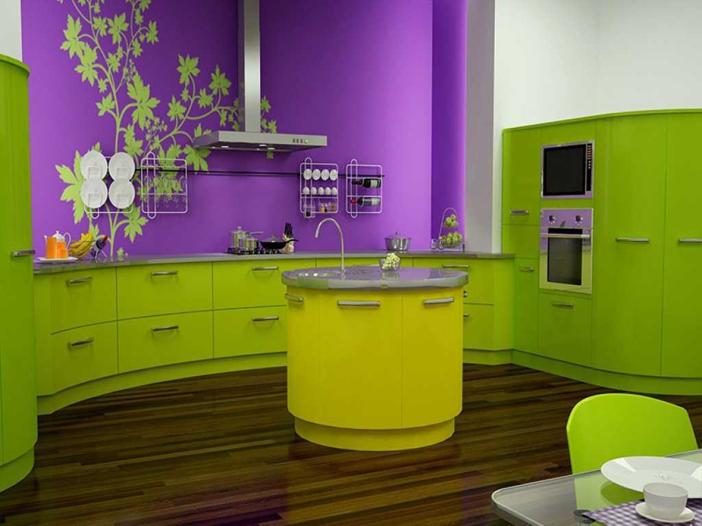
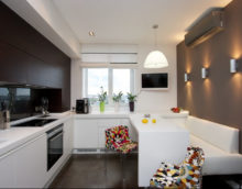
Kitchen design in a combination of different colors
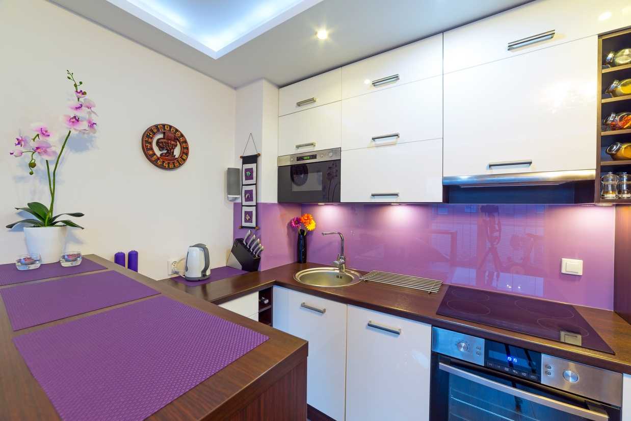
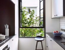
The combination of light colors in the interior of the kitchen
A similar effect has floor porcelain stoneware or tiles laid out with “diamonds” from the entrance (diagonally). The black and white alternation of tiles with a classic checkerboard layout conceals a large area. This technique has been known since medieval Gothic, when the floors of palaces and cathedrals were laid with marble and granite tiles.
For small kitchens, the contrast option is not suitable. It is better to replace it with patterned metlah tiles or abrasion-resistant porcelain stoneware in the “salt and pepper” colors. Achromatic or black and white interior in a modern style is at the peak of popularity in the fashion trends of 2017, as in the photo example.
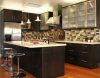
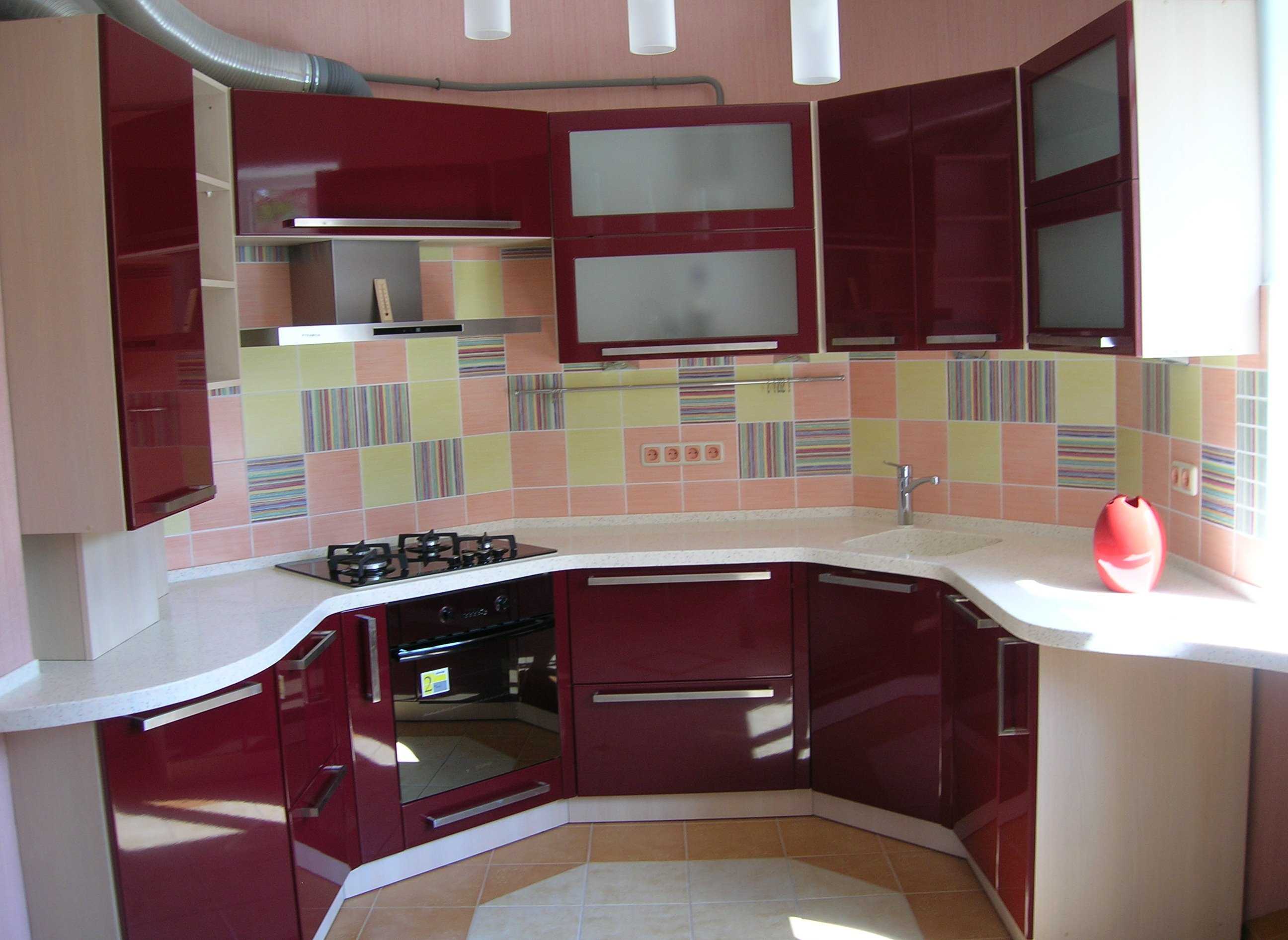
The interior of the kitchen in a combination of different colors
Modern kitchen design in a combination of colors
Dark colors in the interior of the kitchen
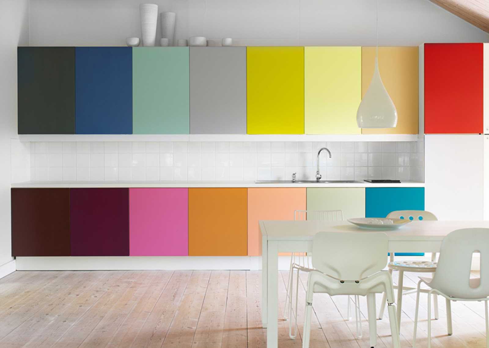
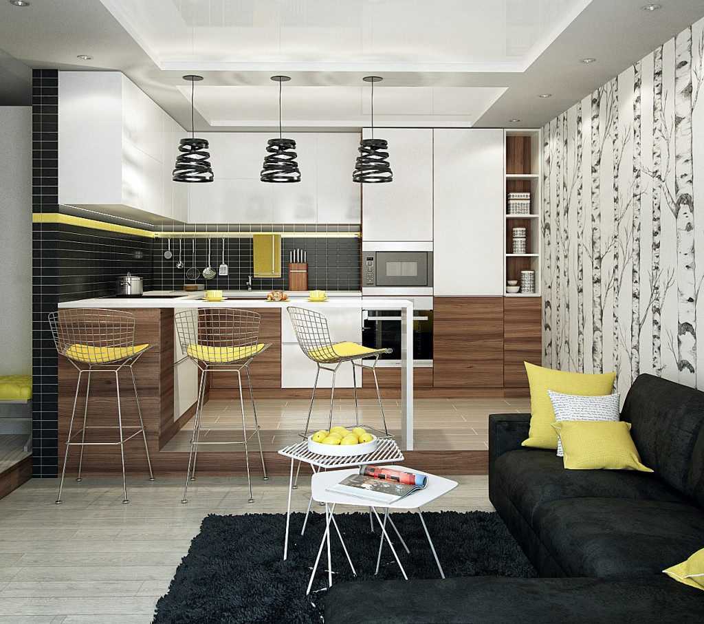
The classic combination in design is only 3 colors, it does not overload the subconscious. If the companions are 4-5, they should be calm, not flashy, equal to saturation. There may be more additions, but provided that the lightest is the background, the darkest is used for linear contrasts and graphic drawings.3 more other shades are additional options of the prevailing choice.
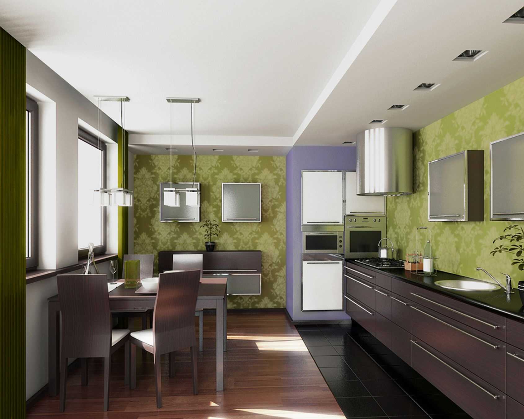
A good example is traditional cuisine in the stylization of southern Provence in its original form. This is a noble milky background, purple or blue linear contrasts, black elements of a small pattern. At the heart are shades of lavender, olive, mustard and blue.
In any kitchen design, small inclusions of a sunny yellow or golden hue, as well as a wine red or citrus accent, are preferable. A great addition will be a bouquet of fresh flowers in a beautiful narrow vase. No less interesting is the large bowl of succulents or whatnot with a cascade of indoor plants in a collection of the same species. The most popular are orchids and violets, the most unpretentious in care are chlorophytums and tradescantia. Living greens will improve the energy of any corner, but one cannot ignore the overall balance of the palette, that is, the prevalence in percentage terms.
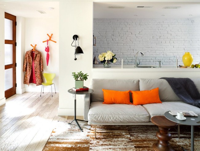
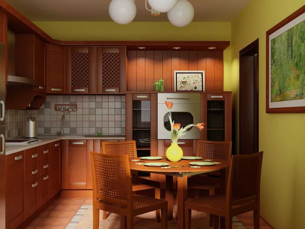
Kitchen design in a combination of different colors

The combination of light colors in the interior of the kitchen
Content
A competent combination of colors in the interior of the kitchen can cause appetite or muffle it. Have a beneficial ability:
Tip. A subconscious influence on the process of digestion of food will help losing weight ladies to curb their appetite and normalize digestive processes. In families where the child eats poorly, make a meal area in the “appetizing” range.
It is recommended to use visual stimulation of the appetite center in the subcortex of the brain. To do this, attach the mural with the image of fruits, berries, slices of citrus, your favorite desserts or dishes, as in the photo.
Remember that depresses the appetite:
When choosing a color scheme, you need to remember that the background will dominate the rest of the palette. The kitchen will merge with the walls of a common color. A motley dark pattern of washable wallpaper or tile will well shade a plain white or beige “kitchen” with a glossy facade. If the doors of the cabinets are decorated with a color print, it is better to choose plain walls.
Important! It is advisable to consult with each family member before the repair and choose the option that will suit everyone. If this is problematic, try to exclude from the unwanted list everything that causes most categorical denial. Then it will be easier to navigate the remaining options.
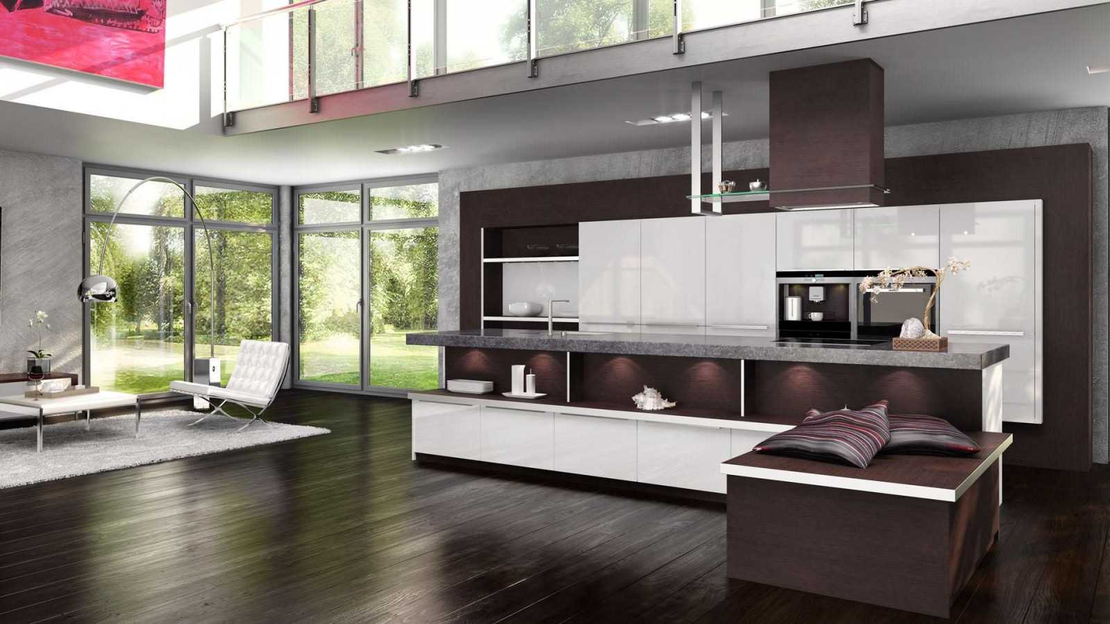
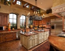
The interior of the kitchen in a combination of different colors

Modern kitchen design in a combination of colors
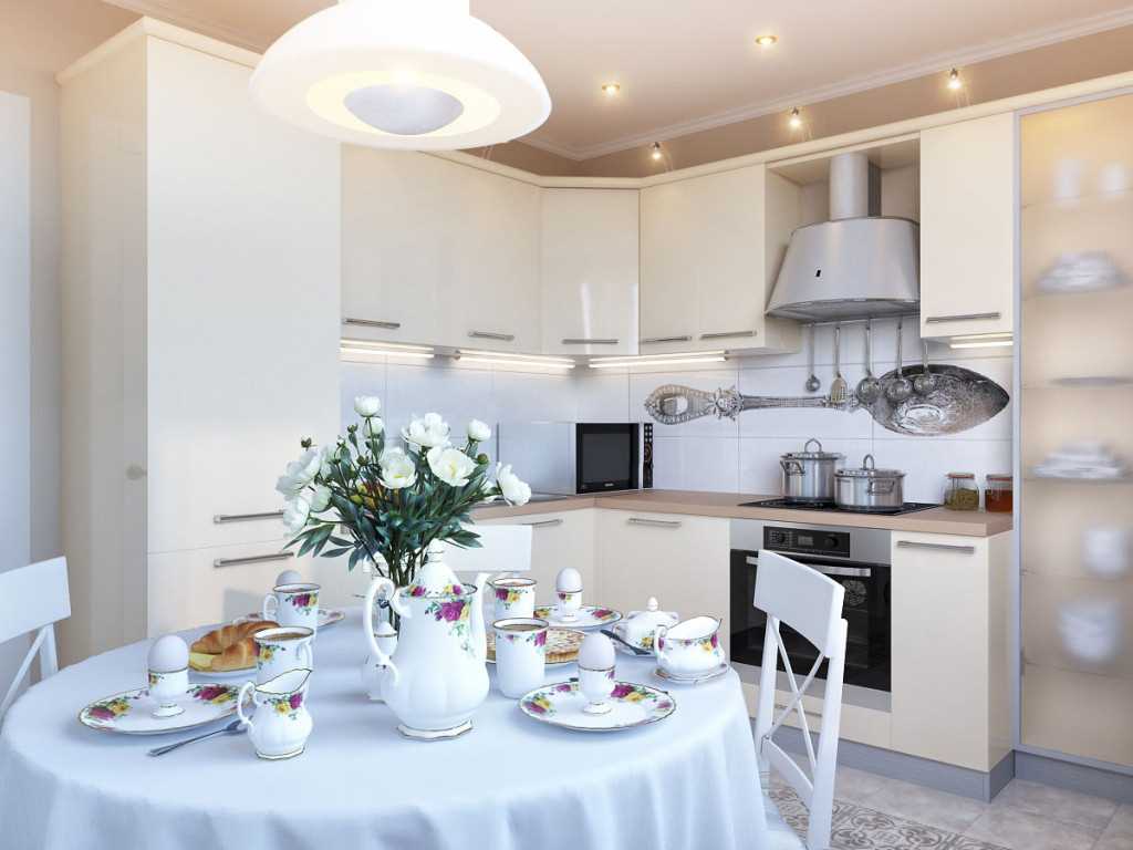
Light colors in the interior of the kitchen
Each person has their own stylistic and color preferences, but the older generation is usually against the silver high-tech solution. Children do not like brown color combinations in the interior of a classic kitchen. And parents of “middle” age will find boring green and gray tones.
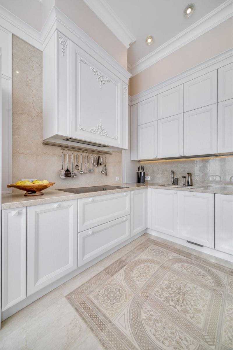
White and beige cuisine will appeal to everyone, if the stylistic solution is correctly chosen, the decor and dishes are in harmony. But remember that there are no good and bad colors, there is an erroneous choice and the wrong proportional ratio. A thick saturated tone makes it heavier, blurred - it refreshes.

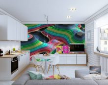
Kitchen design in a combination of different colors
The combination of light colors in the interior of the kitchen
Original combinations can be gleaned in the "color wheel", but do not overdo it with extravagance. If the experiment turned out to be unsuccessful, you can always fix something without expensive repairs by changing the curtains, tablecloth and decoration above the work surface.
Tip.In a faceless interior, add some contrasting elements or elegant lines. If the selected palette is darker than expected, add a diode local illumination for the functional areas.
So that there is no variegation on the verge of tastelessness, select a light background and only one part of the spectrum for detailed design - “warm” or “cold shades”.
Warm tones warm and invigorate:
Cold color combinations for the kitchen soothe and slow down reflexes:
To help the novice home designer - special visualization programs or “designer” color combinations in the interior of the kitchen.

The interior of the kitchen in a combination of different colors
Modern kitchen design in a combination of colors
Light colors in the interior of the kitchen
The combination of the palette can not only form a special aura, but also is able to correct visual perception.
The most effective methods of "expanding" square meters of a small area of urban apartments are:
All these methods of visually increasing the volume of a small room work on their own. They need to make a little imagination, as well as use the classic ways of combining shades in the color wheel.
The priority is a combination of white cuisine with other colors that “attract” more light. For example, indoors on the north side, preferably less furniture and small items. Hang yellow curtains and add a few identical lights in a row near the ceiling. For a small room with windows facing south, a cold range of walls, a matte facade, a large chandelier above the dining table are suitable. Complement this solution with blackout curtains, dark floors with a poorly pronounced pattern and a blue stretch ceiling with diodes around the perimeter.
Kitchen design in a combination of different colors
The combination of light colors in the interior of the kitchen
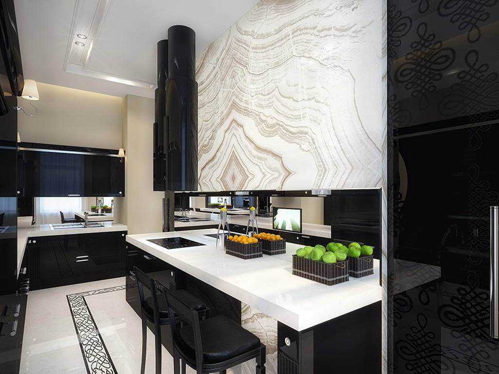
1. In addition to the properties of each shade and its associative perception, it is important to consider the reflective properties of surfaces. For example, black wallpapers and stretch ceilings do not seem too dark, thanks to the “mirror” property. The same can be said about the black bulk floor and a seamless smooth tile resembling a mirror.
Attention! Slippery polished surfaces are not the best option for a kitchen where there is a lot of moisture on the floor. The matte black surface visually absorbs space. And the red walls and furniture all the time “honk” into the emotional sphere, overloading the psyche, up to aggression.
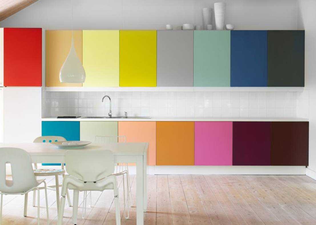
2. Use the color wheel in practice - for a competent combination of opposing shades.Yellow, red and blue (central triangle) are fundamental, when merged from the imposition of these colors new ones are born, they will be related to each other. Diametrically opposed tones also look good in emotional decision. But it is desirable to dilute them with something light with linear contrast.
3. The neutral background is suitable for any combination in the design of the kitchen. But even white has its own shades:
4. Today, loft, techno, high-tech, and other urban styles are in fashion. It is practical, bold and extravagant, especially in the catering department. Those who like chrome surfaces and metal in all its forms will have to work hard to create a welcoming atmosphere. Window textiles or original design curtains, elaborate lamps, furniture with beautifully defined lines and stylish household appliances will help. They will add life to a large aquarium, a pleasant velvety upholstery of the corner and dishes with painting.
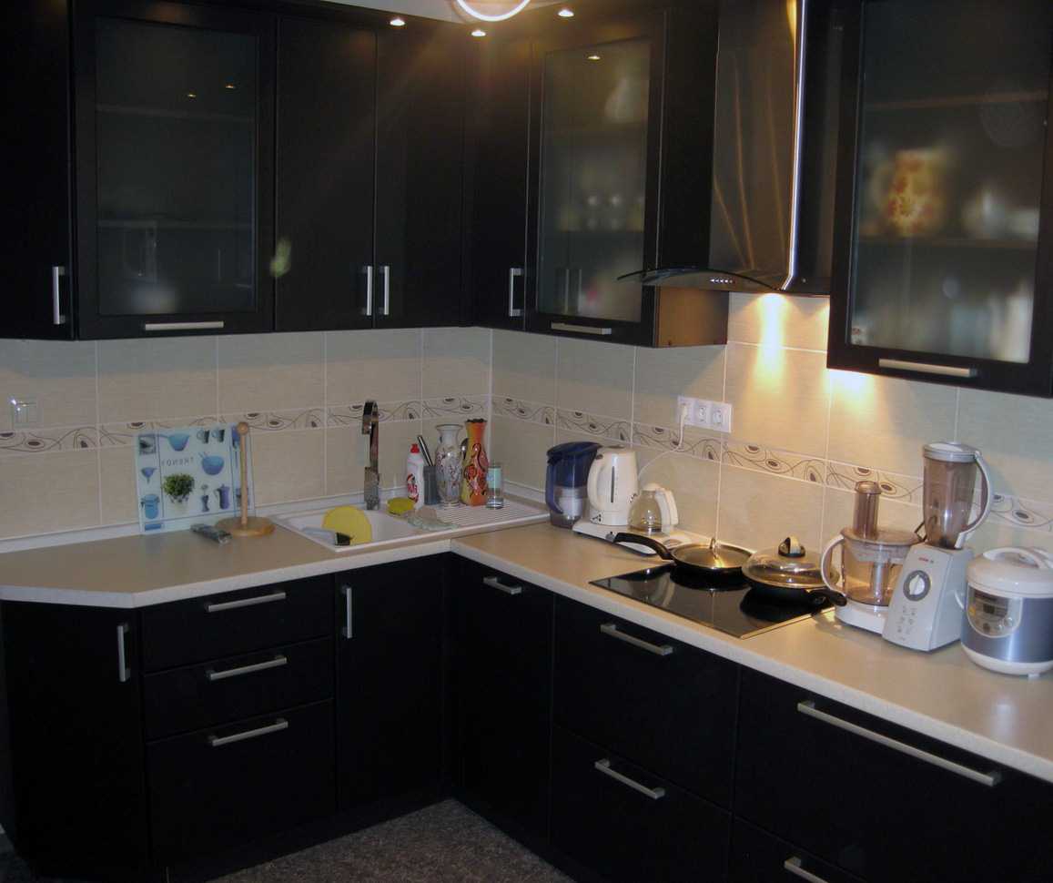
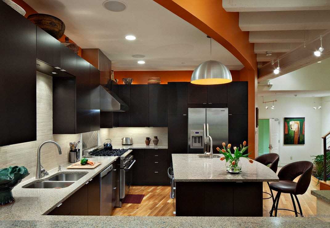
The interior of the kitchen in a combination of different colors
Modern kitchen design in a combination of colors
Dark colors in the interior of the kitchen
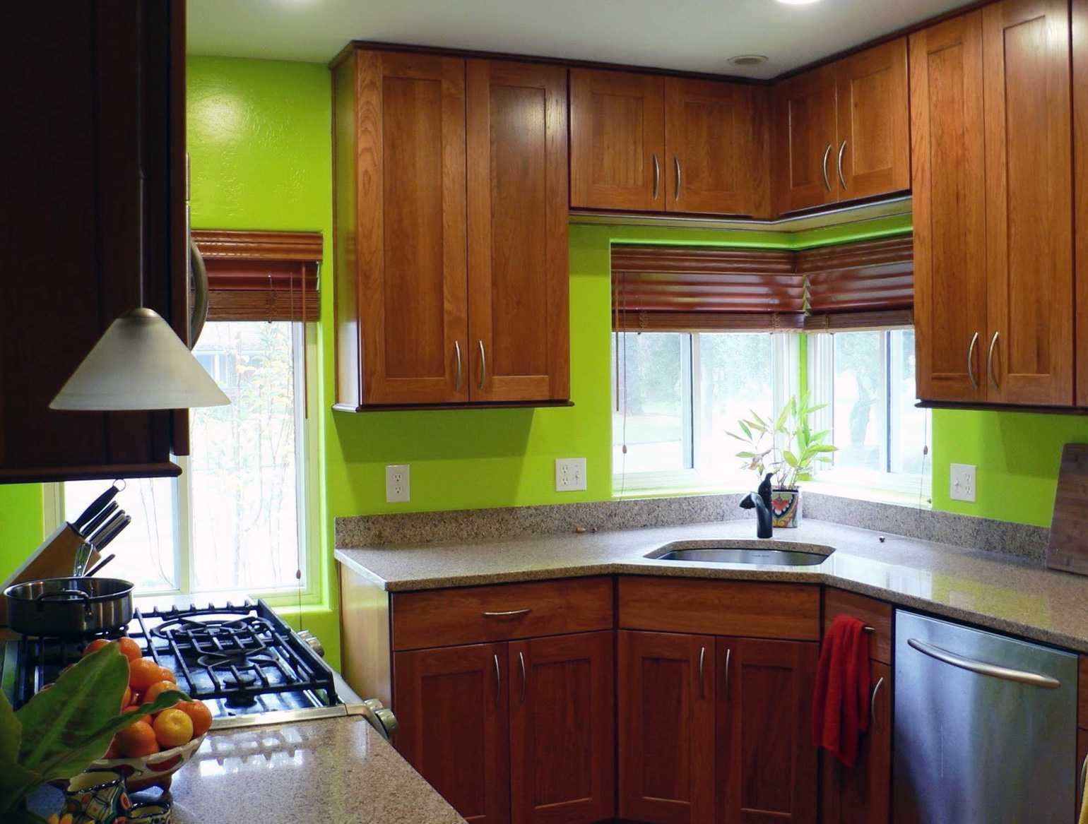
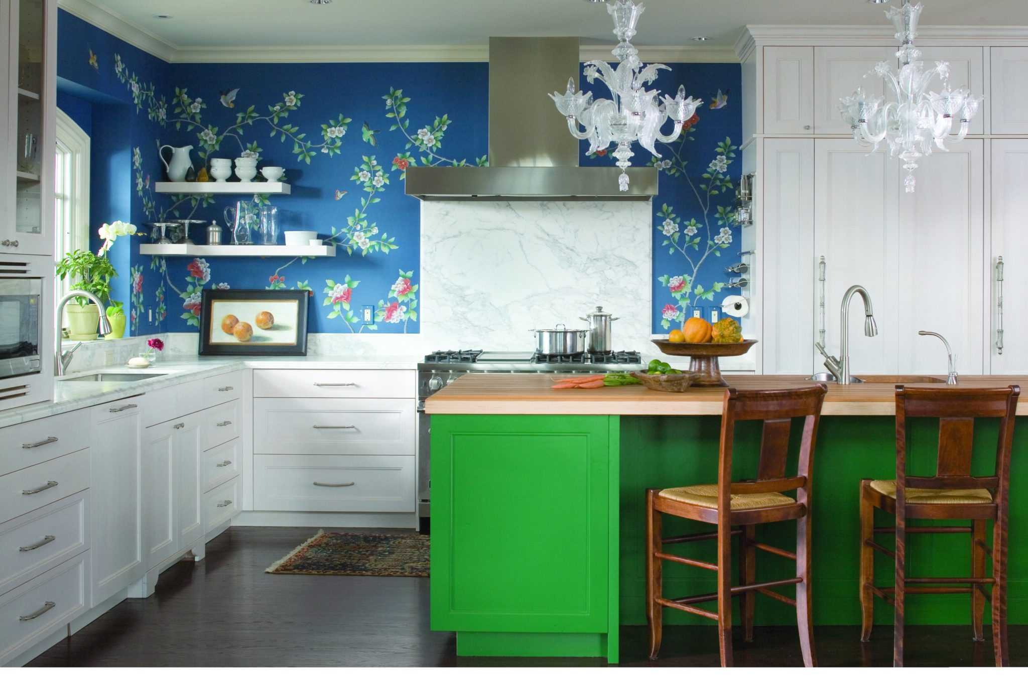
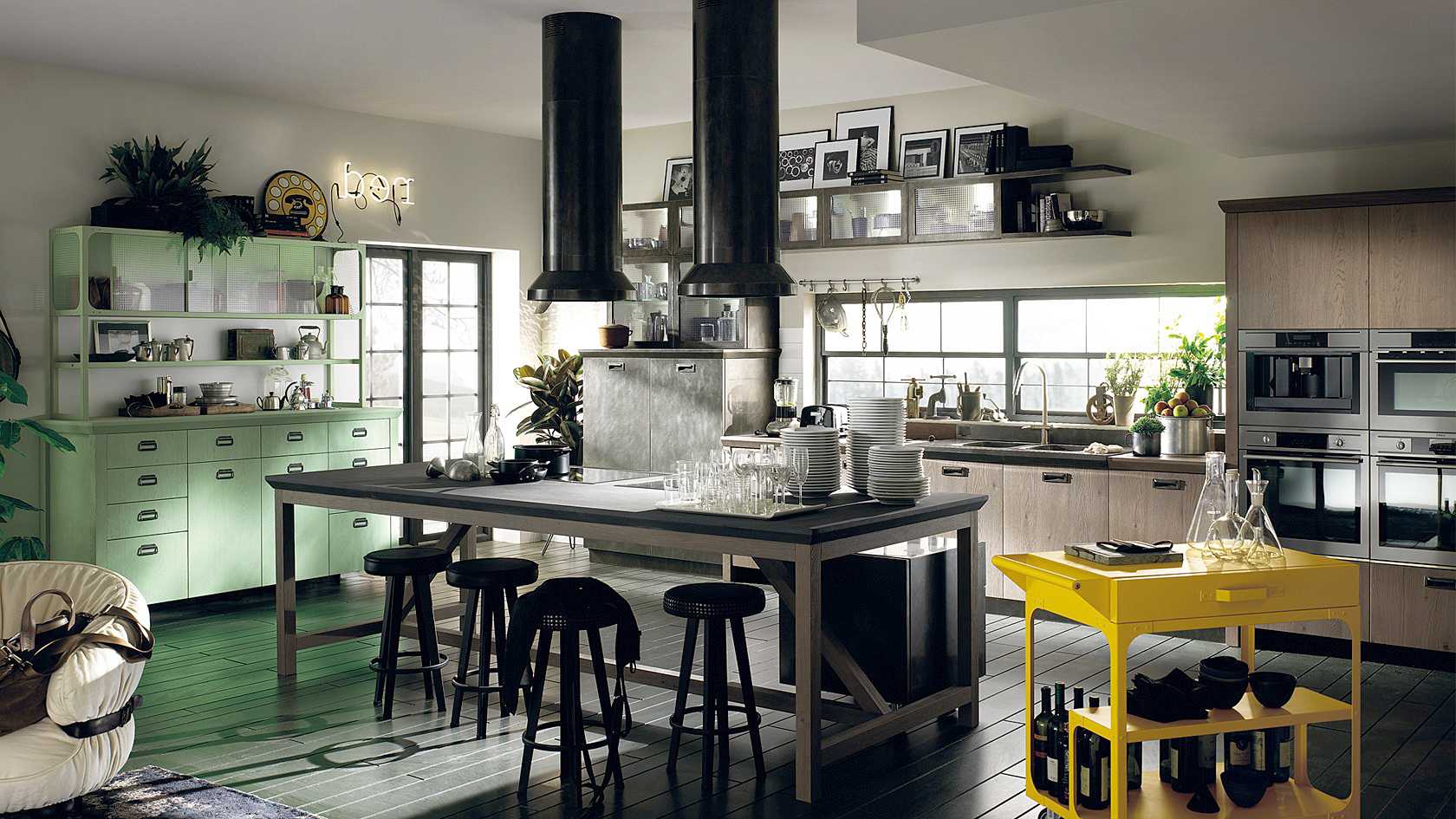
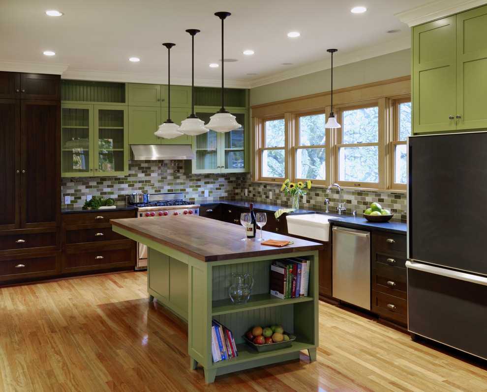
5. Eco-cuisine in green is the traditional choice of those who value everything natural. It is recommended to use natural wood in furniture and imitation of natural stone in the flooring. Photo prints on furniture facades, decorative inserts or large drawings will be appropriate. Still life is chosen for the classic setting. For modern styling it is better to choose computer graphics in a frame or digitizing images of dishes, drinks or fruits.
6. If you want to surprise guests with the color scheme of the kitchen, choose mixed colors. Today, the shade of “dusty rose”, pinkish-gray and lilac beige, remain relevant. This background is perfectly complemented by chocolate contrasts or wenge furniture with chrome handles. Shiny yarn curtains, professional lighting design and black utensils complete the extravagant design concept.
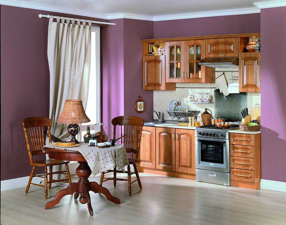
7. Comfort, hospitality, tenderness and warmth embody the beige kitchen, which will not go out of fashion, thanks to the special atmosphere. Although this is a win-win option, try to pick up all the components in one style. In order not to turn out monotonously, decorate the “apron” at the stove with the original mosaic. Paint a free wall or make home-made panels of broken tiles and glass. It’s better to choose a finished sketch - it’s easier to imagine the final result.
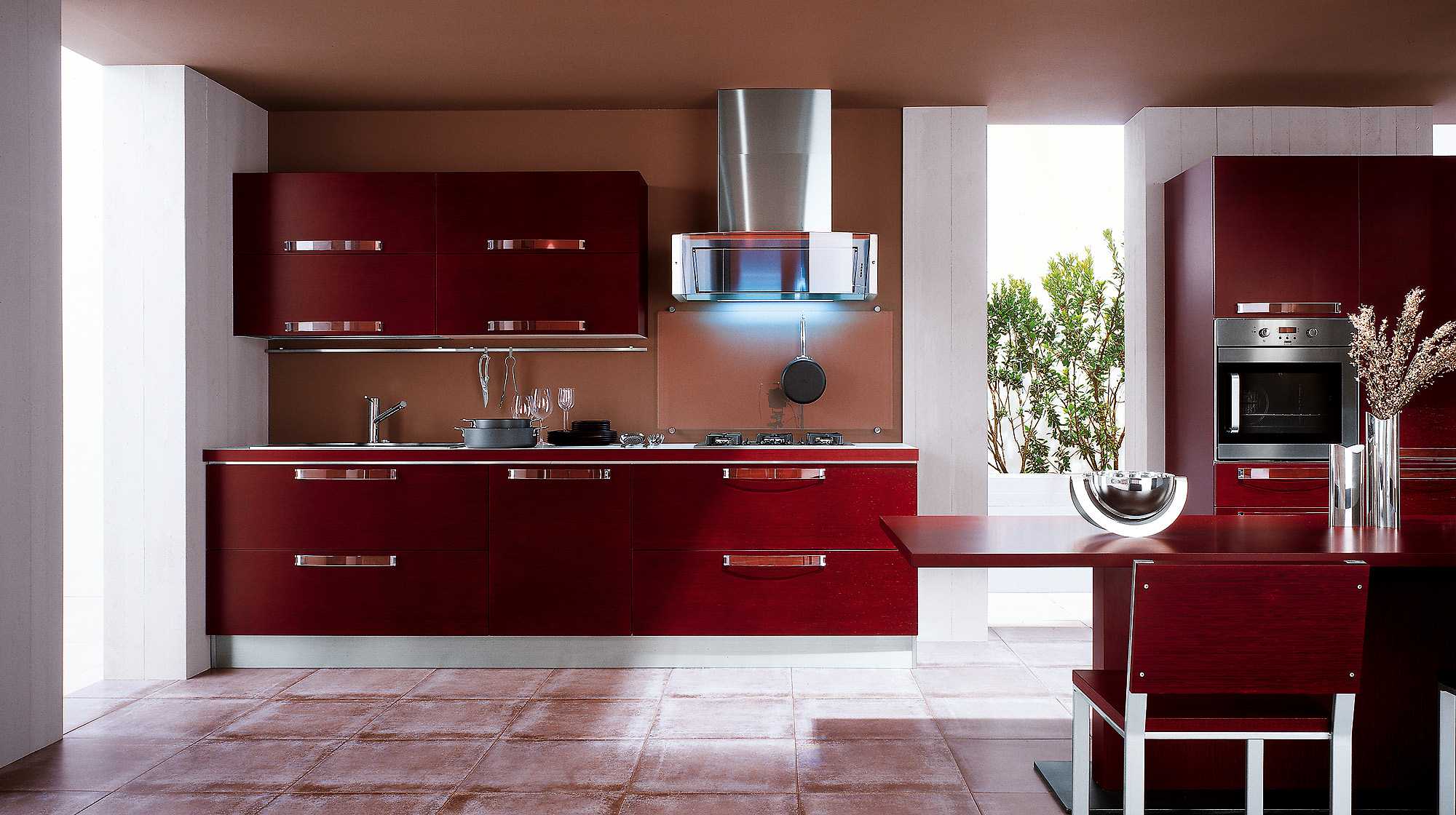
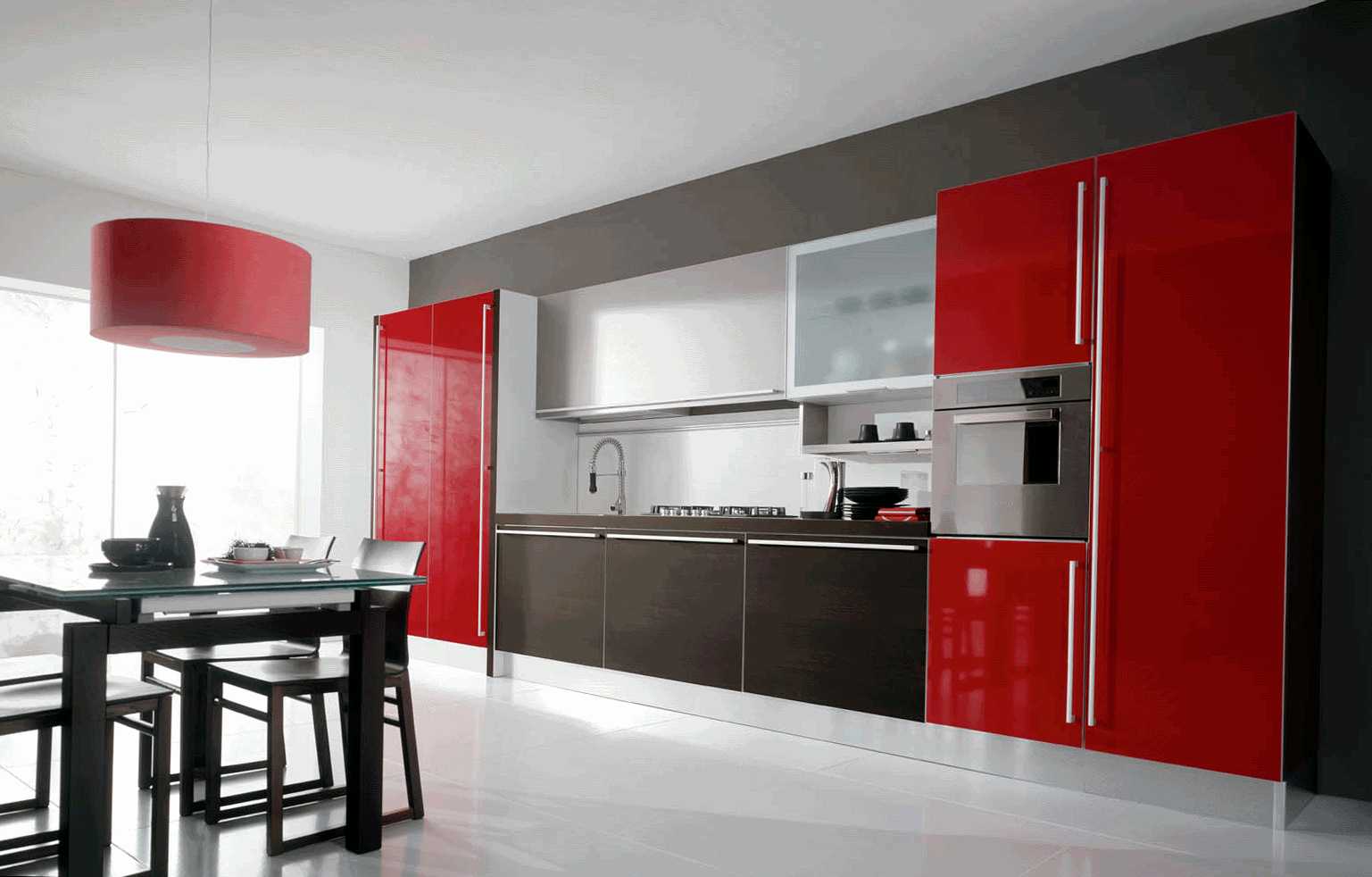
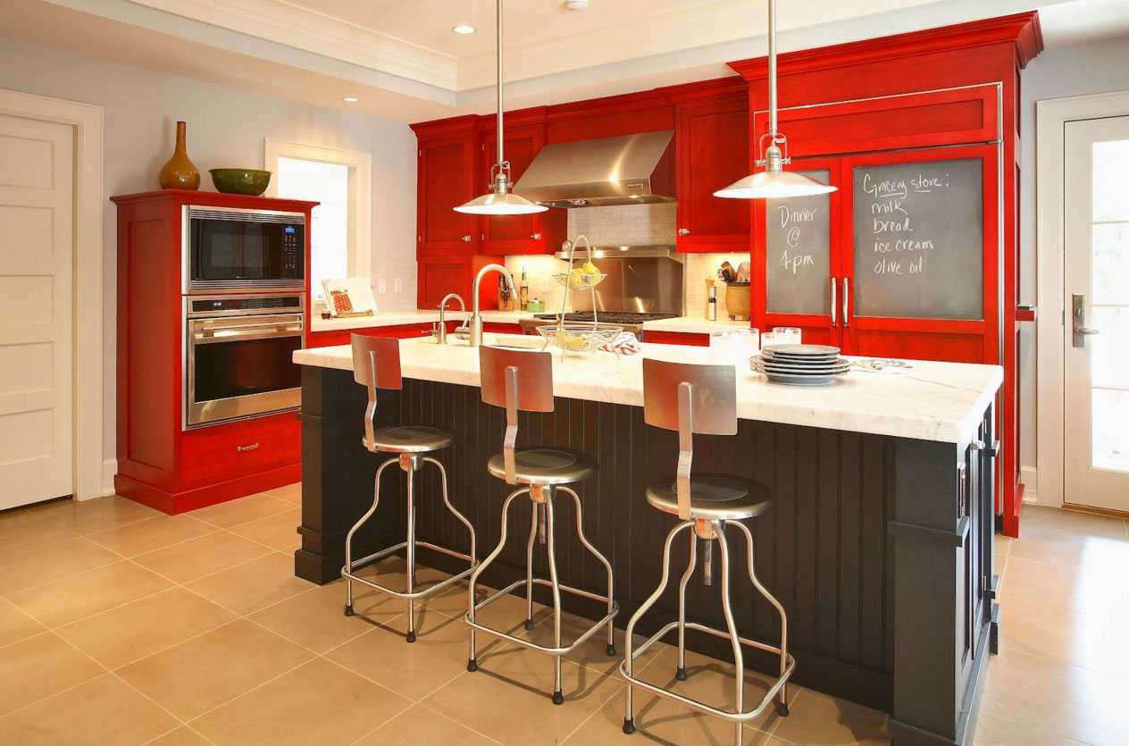
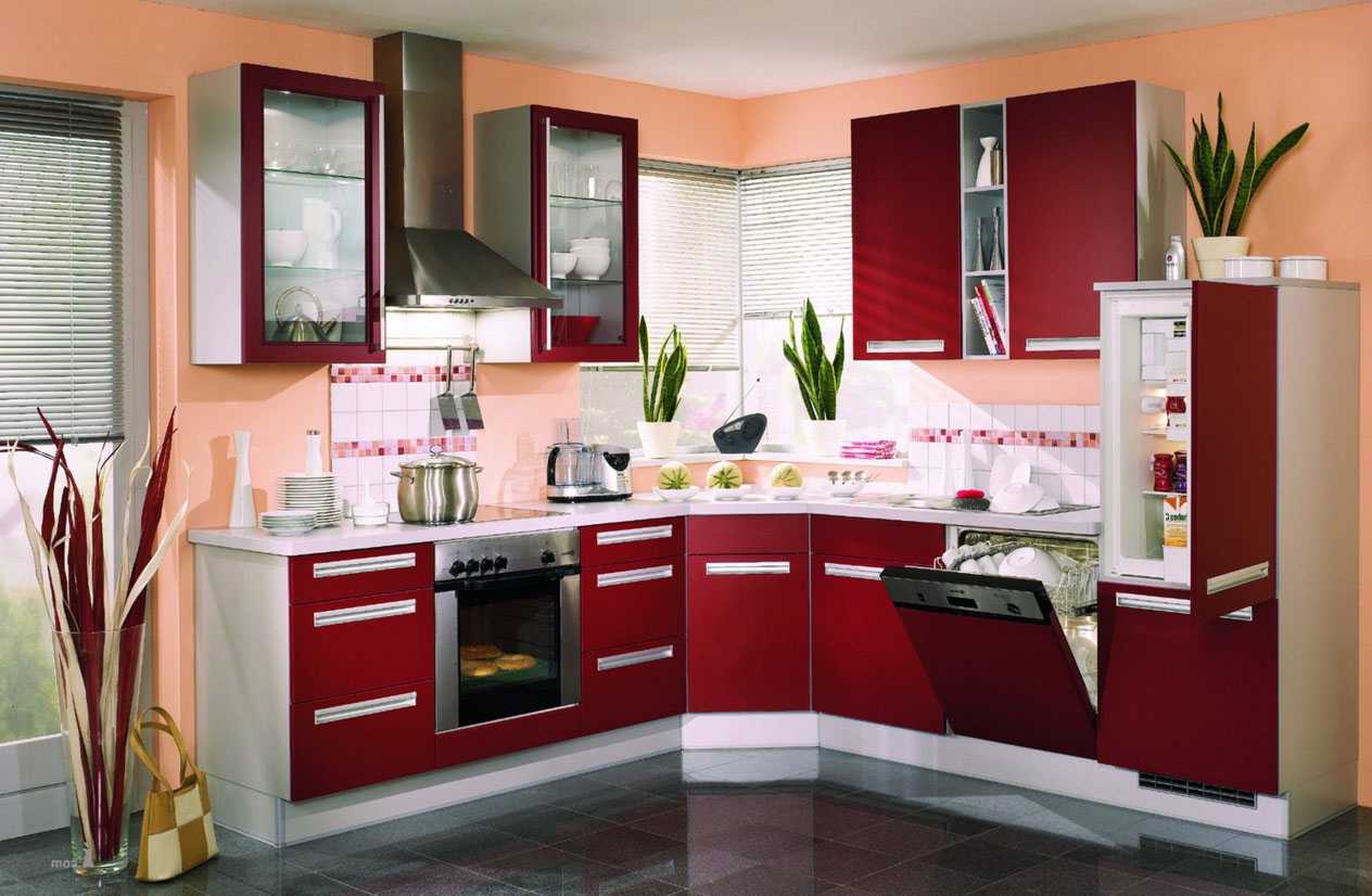
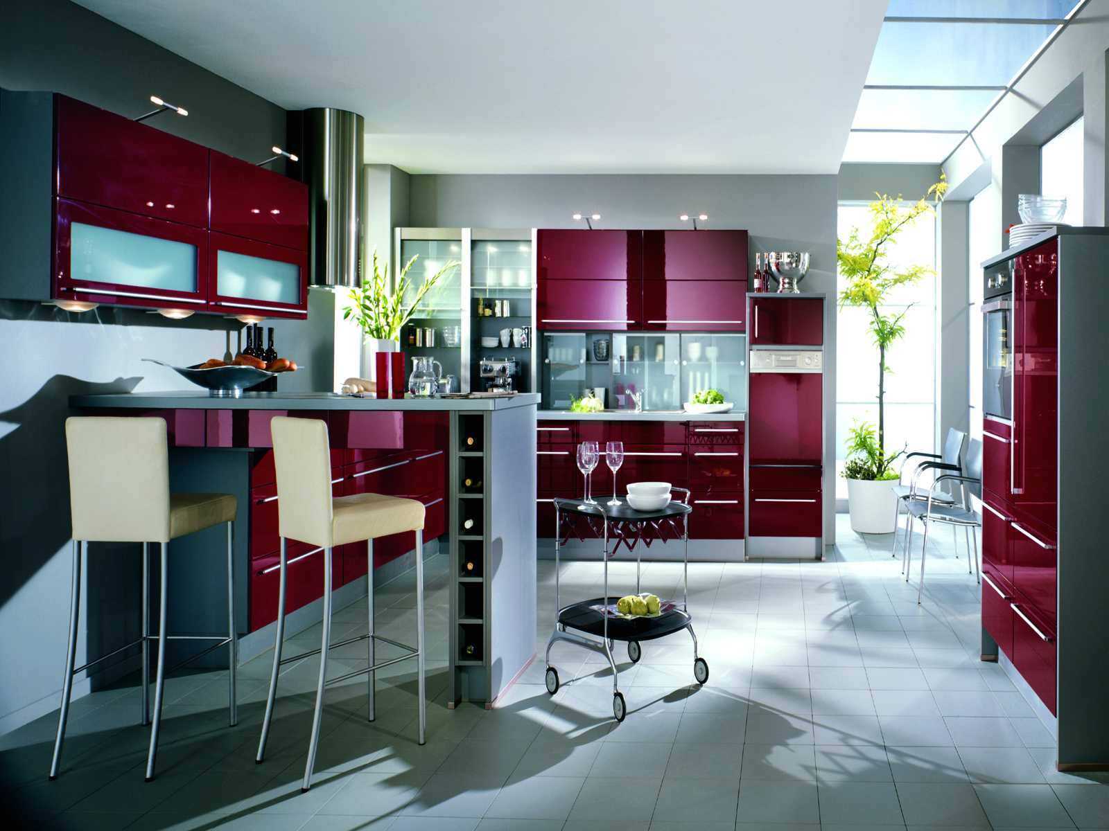
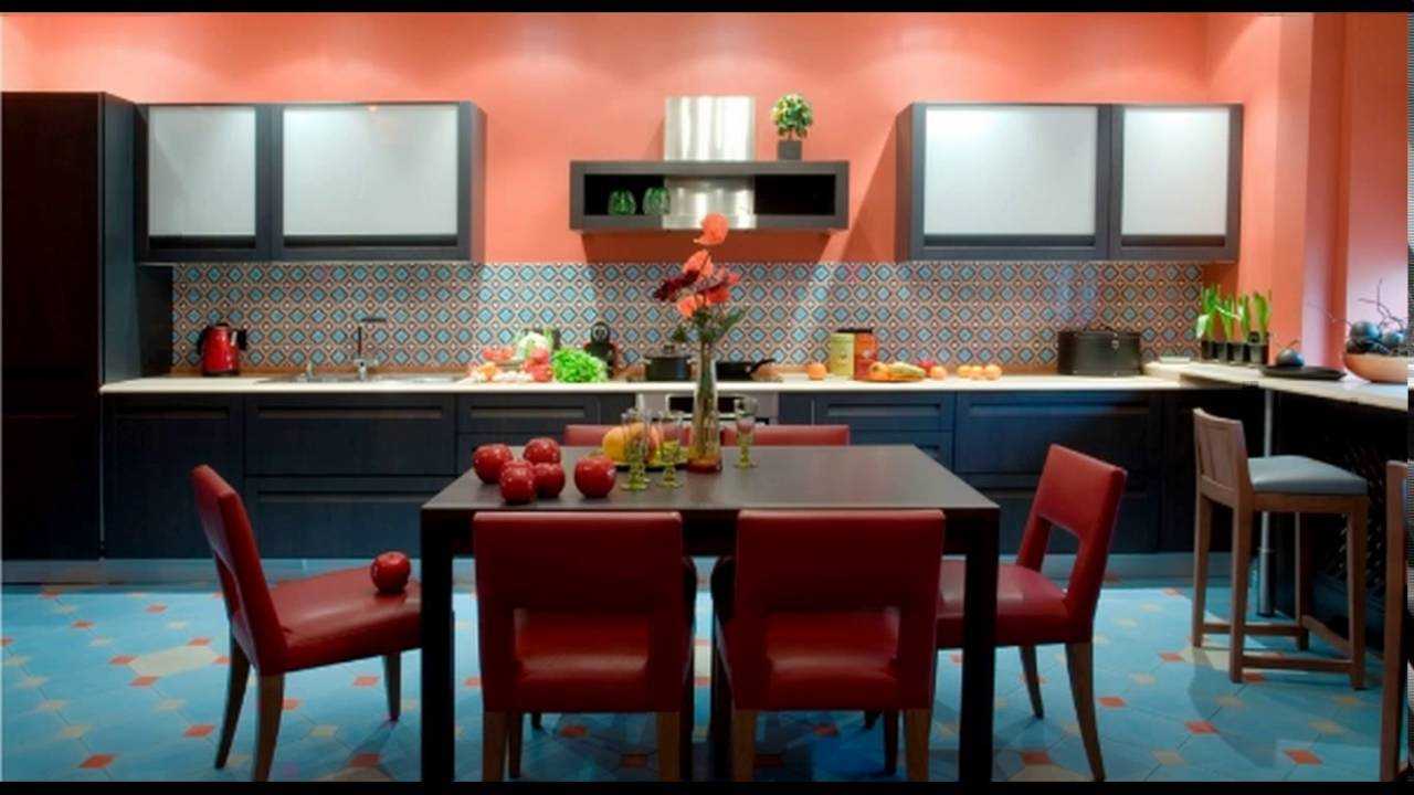
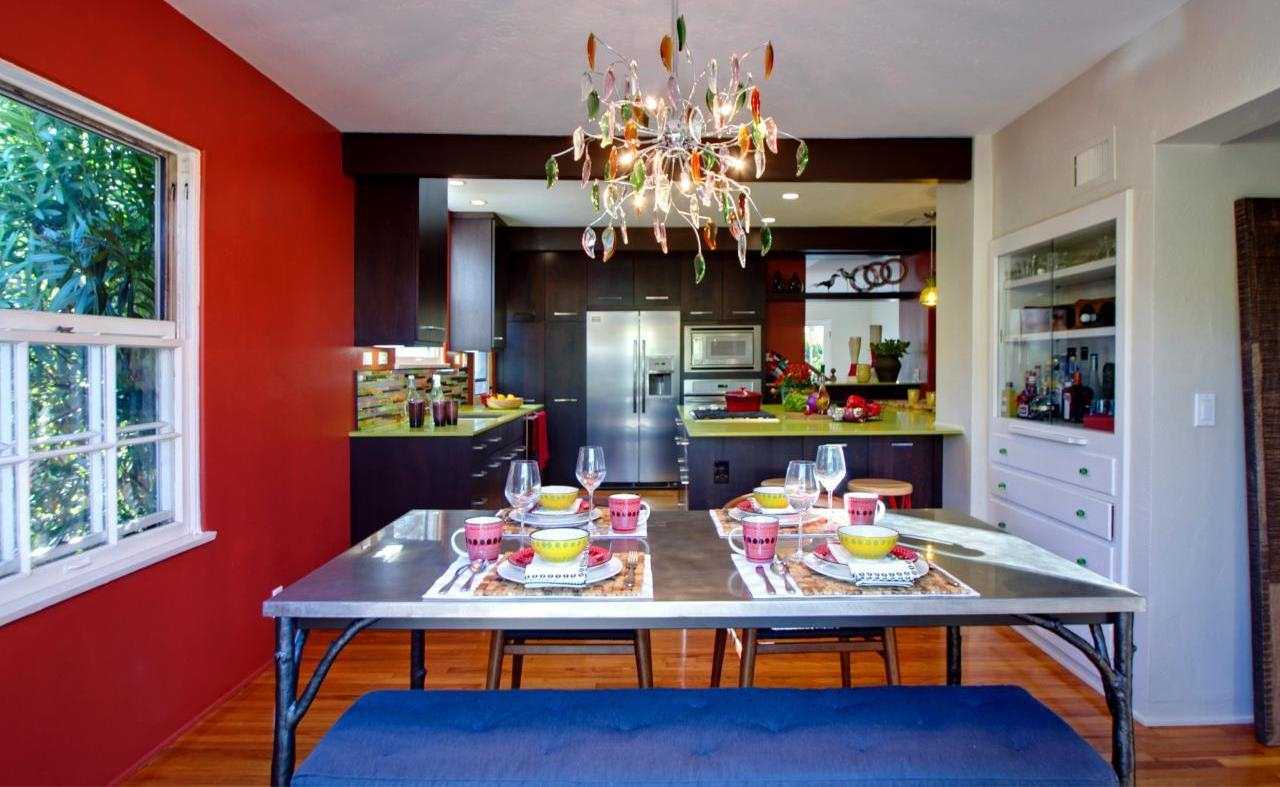
8. Traditionally, red cuisine is chosen by ardent, extravagant, passionate and loving natures. But with red it is easy to overdo it, especially when the shade is chosen incorrectly. Such a decision is well perceived in the "trio" with a white background and black contrast. The overall impression depends on the style.
Kitchen design in a combination of different colors
The combination of light colors in the interior of the kitchen
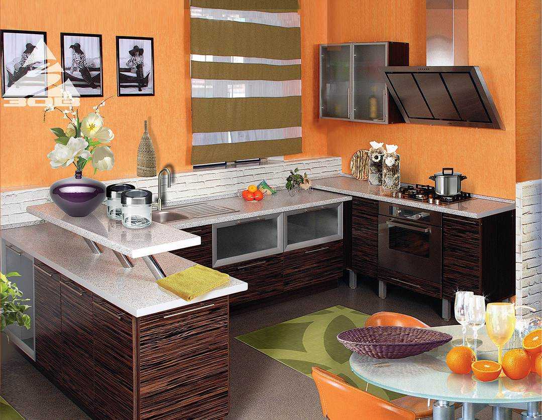
9. The combination of orange with other colors in the interior of the kitchen is considered the most emotional, but it should not be much. Proven selection - with white, black and green. This combination looks fresh and perky, it is recommended for rooms on the north side of the house. Large slices of citrus fruits or images of fruits are always in a good mood when preparing food.
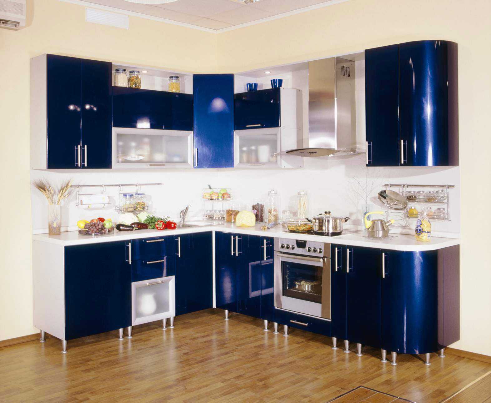
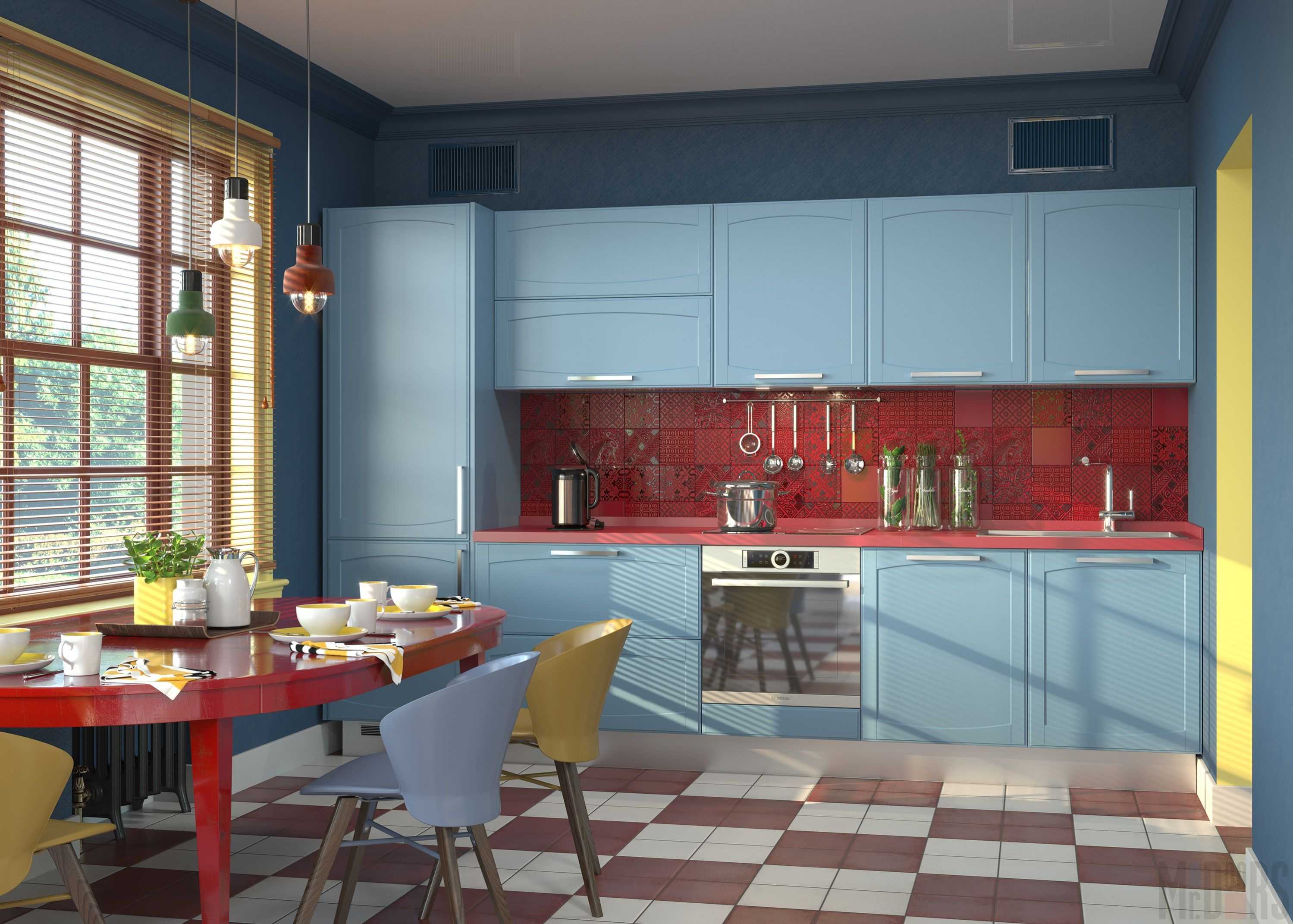
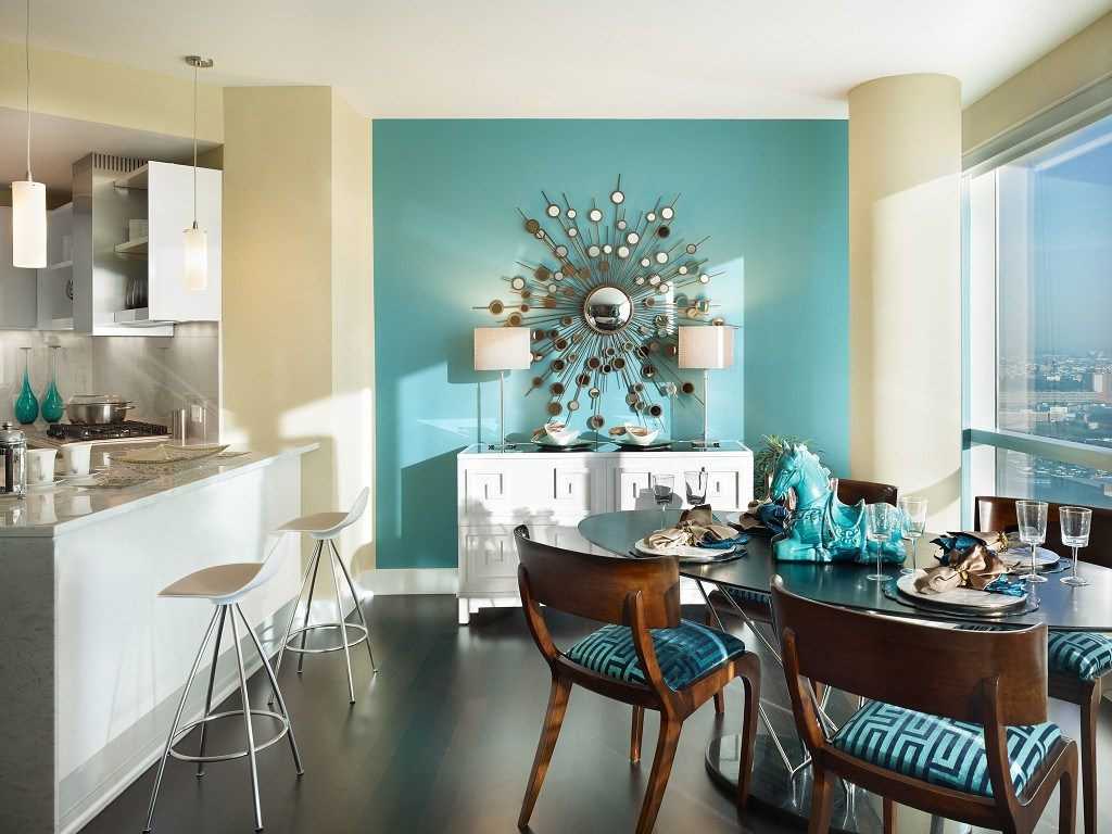
10. Although the blue design does not contribute to appetite, such a corner of cleanliness and coolness will be appreciated by residents of warm latitudes. A similar design is considered traditional for the Mediterranean, Turkish, Greek, Moroccan and marine stylistics. The combination of blue with other colors in the interior of the kitchen involves a white or blue background, blurry shades and a bit of emotional contrasts in the warm palette.


Thank!
In the near future we will publish information.